What if a small file error, not the design itself, delays your print job? Common printing mistakes to avoid often start with details that are easy to miss: an image with insufficient resolution, incorrect colour settings, missing bleed or text placed too close to the trim edge. Checking these details before production makes corrections easier.
This checklist shows you what to review before sending artwork to print and what to look for when approving a proof. You’ll learn how to prepare a high-resolution PDF, assess image quality and colour settings, and protect key design elements from trimming or scaling issues.
Work through the checks in order, from file setup and page layout to text, colour and final approval. You’ll see how crop marks and bleed support accurate trimming, and how to keep your file, proof and production instructions aligned.
Key Takeaways
- Use a staged review to catch common printing mistakes to avoid before your artwork enters production.
- Check dimensions, images, colour settings, fonts and your exported PDF in a consistent sequence.
- Understand how trim, bleed and safe areas protect important design elements, and follow the requirements for your print format.
- Review copy, design and technical details separately so each approval has a clear purpose.
- Use a final handoff checklist to keep your file, proof and production instructions aligned.
Common printing mistakes to avoid before production begins
Preventable print errors often begin before a file reaches production. A missing image, incorrect page size or unreviewed text can affect clarity, trimming, consistency or approval. The common printing mistakes to avoid are easier to catch when you match each check to the item you’re producing. For a brochure, check page order, panel layout and how the content reads across spreads. For a business card, confirm the finished dimensions and make sure small text is legible and safely positioned.
Print preparation brings together artwork, format, proofing and production requirements. The Prepress process covers checks that prepare files before printing. Follow the same logic in your review: check the file, assess the layout, review the proof, then confirm the final handoff. This sequence gives each issue a clear point of review.
Why small print errors can affect the finished item
A detail that looks minor on screen can be obvious in print. An image that lacks detail at its final size may look soft or pixelated. If artwork doesn’t extend into the required bleed area, trimming can leave a narrow unprinted edge where colour or imagery should reach the edge. Screen colour can also differ from printed colour, so don’t treat your monitor as an exact preview of the finished piece.
The right checks depend on what you’re printing. For a multi-page booklet, review page sequence and spreads. For a business card, check dimensions, text placement and any artwork that runs to the edge. Use the print specification for the item as your reference rather than applying one generic setup to every job.
Use a checklist rather than relying on memory
Assign one person to coordinate the final file review. They can confirm which version is approved, gather feedback and make sure the production file reflects the final decisions. This helps prevent an earlier draft being sent by mistake or a late change being missed when several people have reviewed the design.
Keep technical checks separate from proofreading and design approval. Each review answers a different question:
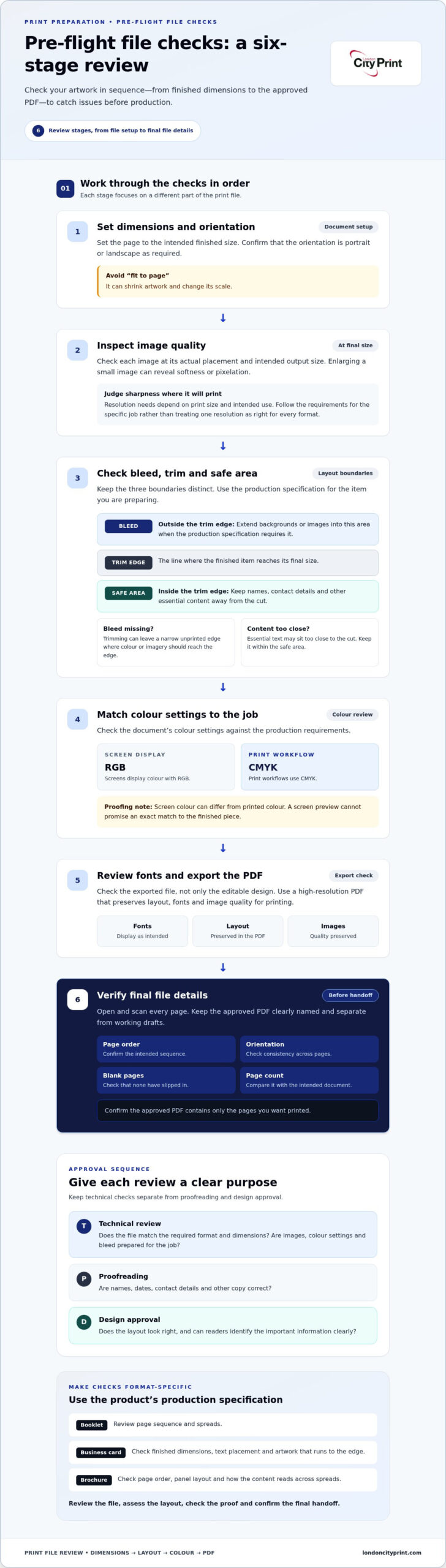
- Technical review: Does the file match the required format and dimensions? Are images, colour settings and bleed prepared for the job?
- Proofreading: Are names, dates, contact details and other copy correct?
- Design approval: Does the layout look right, and can readers identify the important information clearly?
Different formats need different checks, so tailor your list to the product and production specification. Work through file setup, layout and trimming, then check colour, copy and approvals before preparing the final handoff.
Avoid file preparation mistakes with pre-flight file checks
Start with the document itself, then review the elements that affect how it prints. Pre-flight file checks examine technical details before production, helping you catch problems while you can still correct the artwork. Use the same sequence for every job so you don’t overlook a setting when working to a deadline.
- Dimensions and orientation: Set the page to the intended finished size and confirm it uses the required portrait or landscape orientation. Don’t rely on fit to page, which can shrink artwork and change its scale.
- Images: Inspect each image at its actual placement and intended output size. Enlarging a small image can reveal softness or pixelation that wasn’t obvious when it appeared smaller on screen.
- Colour: Check the document’s colour settings against the requirements for the job. Screens display colour with RGB, while print workflows use CMYK. A screen preview can’t promise an exact match to printed colour.
- Fonts and export: Review the exported file, not only the editable design. Make sure the PDF preserves the layout and image quality, and check that text appears as intended.
- Final file details: Check page order, orientation and blank pages before sending the approved version.
Check dimensions, images and colour settings
Judge image sharpness at the size it will appear in print, not just at its on-screen scale. The 300 DPI myth comes from treating one resolution as correct for every format. Resolution needs depend on the print size and intended use, so a large-format image and a small printed item may need different preparation. For brands producing high-impact visual collateral, working with specialists like Framework Creative ensures photography and visual media are captured and prepared at optimal print resolution. Follow the requirements for your specific job.
Check fonts, PDF export and file details
Export high-resolution PDFs, which preserve layout, fonts and image quality for printing. Open the exported file and scan every page. Check that fonts display correctly, page order is right, orientation is consistent and no blank page has slipped in. Requirements vary by format and file setup, so use the production specification rather than assuming one export setting suits every job.
Keep the approved PDF clearly named and separate from working drafts. This makes the final version easy to identify. Before submission, compare the PDF’s page count with your intended document and confirm that it contains only the pages you want printed.
Prevent layout, bleed and trimming mistakes in print design
Accurate layout depends on three boundaries: the bleed area, trim edge and safe area. Each has a different purpose. Bleed gives edge-to-edge artwork extra space beyond the final cut. The trim edge marks the finished size. The safe area keeps important content away from that cut. Confusing them can leave white edges or put essential text too close to the edge.
Outside the trim edge: Bleed area. Extend backgrounds or images into this area when the production specification requires it.
Trim edge: The line where the finished item reaches its final size.
Inside the trim edge: Safe area. Keep names, contact details and other essential content within this area.
Bleed requirements depend on the item and production specification, so don’t apply one fixed measurement to every job. A brochure, business card and poster can have different setup needs. Follow the instructions for the specific format, including whether to add crop marks. Crop marks are lines on a printed sheet that show where it should be trimmed to the final size. Add them only when the production instructions call for them.
Set bleed, safe margins and crop marks correctly
Check the edges of the design before export. If a background colour or photograph should reach the edge, extend it into the required bleed area rather than stopping it at the trim line. Keep small text and important details inside the safe area. This gives trimming room without putting information at risk.
Check layout, scale and finishing choices
Compare the document’s final dimensions with the requested print size. A file can look correctly proportioned on screen but still have the wrong page size. Avoid relying on fit to page without checking the result. This setting automatically shrinks a document to fit the printable area and can create scale errors. That matters for technical documents, where a change in scale can undermine technical precision.
For bound work, check page order and how the pages will read once assembled. A booklet designed as facing pages may need a different file arrangement from single pages supplied in reading order. Consider the binding method when placing content near the inner edge. Wire binding allows a document to lay flat, but important text still needs to remain clear of the binding area. Review the finished layout at the intended size, not only as a zoomed-in screen view.
These are some of the common printing mistakes to avoid because they can be hard to spot in an ordinary on-screen review. Before approving the file, confirm the finished dimensions, required bleed, safe placement of essential content, crop-mark instructions and any scale or binding considerations. Use the print specification to guide each decision.
Catch colour, copy and approval errors before signing off
Don’t treat approval as one final glance. Copy, design and technical setup need separate reviews because each catches a different type of problem. A page can look polished but contain a misspelled contact detail, or read correctly while the final file has a layout issue. Give each reviewer a clear task, then record approval against the exact version intended for production.
Proofread every version and confirm final artwork
Check names, contact details, dates, spelling and page references against the approved copy. Then compare the proof with the latest artwork so you don’t approve an outdated draft. Ask reviewers to report specific corrections, and make sure someone applies them before the final check. Record who approved the copy, design and technical file, and identify the approved version clearly before it moves into production.
Keep the three approvals distinct:
- Copy approval: Confirm all wording and details against the source information.
- Design approval: Check hierarchy, spacing, alignment and how the content reads as a finished piece.
- Technical approval: Verify that the production file follows the job’s requirements.
This division helps reviewers focus. It also makes late changes easier to manage: identify whether the correction affects wording, design or file setup, then send it to the right person for approval.
Review colour, stock and finish expectations
Paper weight affects how a printed piece feels in your hand, while the paper surface and finish influence its appearance. Choose with the item’s purpose in mind. A brochure that people handle and a flyer distributed quickly may call for different tactile and visual qualities. Where possible, review the actual stock and finish rather than relying only on their appearance in a digital layout.
Digital samples are physical proofs you can use to assess colour, weight and finish before full production. They give you a practical way to judge the printed result and identify a mismatch with your expectations. A high-gloss finish can increase shine and colour saturation, but it can also create reflections. Consider how the piece will be viewed, handled and read, then approve the finish with that use in mind.
Before sign-off, make sure the proof matches the final artwork, the copy has a named approver, and the selected paper and finish suit the intended item. These checks help prevent common printing mistakes to avoid at the approval stage and give production a clear, agreed reference.
London City Print prints booklets, brochures, business cards and other materials. Explore London City Print’s printing services when you’re ready to prepare approved artwork for production.
Final checklist to avoid common printing mistakes
Before you submit artwork, make one final pass through each stage below. This turns separate technical and approval checks into a clear handoff process and helps you catch missing details before production begins.
Run the final five-stage pre-print check
- File: Confirm the document dimensions and orientation match the intended item. Check image quality at the final size, colour setup, font display and exported PDF. Make sure you’re using the approved version.
- Layout: Check bleed and safe margins against the production specification. Confirm crop marks follow the supplied instructions, scale is correct and all pages appear in the intended order.
- Content: Proofread names, contact details, dates and page references against the approved copy. Check that every correction appears in the final artwork.
- Proof: Confirm the proof matches the final file. Review colour, paper choice and finishing details, and record approval before the file moves forward.
- Handoff: Name the approved file so it’s easy to identify, remove obsolete versions from the submission and include the agreed production details.
Work through the stages in sequence. If a proof needs a correction, update the artwork and review the revised file rather than relying on notes attached to an earlier version. London City Print was founded in 2009. Digital printing is most efficient for short runs under 500 units.
Prepare a clear production handoff
Make the handoff specific enough for the production team to act on without interpreting your intentions. Include the agreed finished size, quantity, stock and finishing requirements. Keep these details with the approved artwork, and use a clear filename to distinguish the final PDF from working drafts.
For a booklet or brochure, include the agreed page arrangement and binding details with the file. If you’re preparing one of these formats, the professional booklets and brochures guide can help you plan the job. Keep the final specifications in one place so the artwork and production details stay aligned.
Use this checklist before you submit your next print job. Clear files and complete instructions help your project move forward with confidence.
Make your next print job easier to approve
A dependable print workflow starts with clear decisions and a single approved file. Make artwork review a defined step in your project plan, with one person responsible for confirming that the final version and production instructions stay aligned. That habit helps your team move from design to production with fewer last-minute uncertainties.
Turn the common printing mistakes to avoid into a sign-off routine your team can repeat. Keep the approved artwork, specifications and decision record together, so everyone works from the same reference. For your next project, consider how paper choice supports your brief. London City Print offers FSC-certified paper and eco-conscious stocks for print projects where material choice matters.
Ready to plan your next print job? Explore London City Print’s professional printing services and discuss your project with the team. Prepare your artwork and production details, then get in touch to move your print job forward.
Frequently Asked Questions
Can I send a Word document to print, or should I export a PDF?
Export a PDF for a consistent print handoff, unless the production instructions request another format. A Word file can reflow if fonts or settings differ on another computer, shifting line breaks or page breaks. After exporting, open the PDF and inspect every page. Check that headings remain in place and tables or footers haven’t moved.
What happens if I spot a mistake after approving a print proof?
Tell the print team as soon as you spot it, and identify the approved file, the affected page and the exact correction. If production hasn’t started, the team may be able to use a revised file, depending on the job’s stage. If printing has already happened, the correction may not apply to that run. Don’t send a replacement without clearly marking it as the new approved version.
Why do printed colours look different from colours on my screen?
Screens create colour with light, while printed pieces use ink on a chosen material, so the two views can differ. A screen set to high brightness may make colours look more luminous than they appear on paper. For a brand colour that needs careful review, assess a physical sample under the lighting where the piece will usually be viewed. This gives you a more relevant reference than a screen preview alone.
Should I use fit to page when printing a technical drawing?
Usually not if the drawing must retain its specified scale. Fit to page can reduce or enlarge the page to suit the printable area, changing measurements. Check the print dialogue for scaling options and select the setting required by the drawing’s instructions. After printing, compare a labelled dimension or scale bar with a ruler before relying on the copy for measurements. Keep the original digital file unchanged.
Do I need crop marks on every print file?
No. Add crop marks only when the production instructions call for them. A file prepared to the finished page size may use a different setup from artwork supplied on a larger sheet with trim guides. Extra marks placed inside the artwork can appear in the finished design, so don’t add them as decoration or assume your export settings should always include them. Follow the file instructions for the job.
How can I prevent text being cut off when a print is trimmed?
Keep essential text and details away from the edge where trimming will occur, using the safe area specified for the item. Check the layout at its final printed size, since small text close to an edge can be harder to assess when you view the design zoomed in. For a business card, pay particular attention to names and contact details so they remain clear after trimming.