The ink drying does not complete a printed piece. Print finishing covers the processes printers apply after printing, from coatings that change the surface to embossing and foil stamping that add texture or visual emphasis. With print finishing options explained in practical terms, you can choose a finish that supports both your design and how you plan to use the piece.
It’s easy to focus on colour, images and layout, but the finish also shapes the impression a printed item makes. A glossy area can draw attention to a logo, while a raised or recessed detail adds a tactile element. A protective coating can also help printed materials withstand frequent handling.
This guide explains how common finishes work and what they can bring to business cards, brochures, invitations and packaging. You’ll learn how coatings affect appearance and protection, how embossing and foil stamping alter a design, and what to consider when choosing finishes for different print products.
Key Takeaways
- Choose a finish by weighing how you will use the printed piece, the impression you want to create and your brand identity.
- Use spot UV to add selective gloss and contrast, or consider other coating approaches for a different surface effect.
- Understand how embossing, debossing, foil stamping and die-cutting can add texture, detail or a distinctive shape.
- Match protection and surface finishes to handling needs, from business cards and brochures to invitations and packaging.
- Explore how printing and binding options can support business stationery, brochures and other professional materials.
What is Print Finishing?
Print finishing covers processes that a printer applies after printing, including trimming, folding, binding and surface treatments. With print finishing options explained through practical examples, you can compare what each process does and how it affects the final piece.
Choosing Finishes for a Project
Choose a finish by matching the project’s use, desired impression and brand identity. A brief that explains print finishing options in plain terms makes choices easier to compare. For example, a pocket-sized event handout may need a fold, while a presentation cover could use a glossy surface for visual impact. Frequently handled materials may benefit from lamination. A restrained brand might favour matte, while a premium identity may use tactile or reflective details.
Binding and Stapling Options
Binding secures pages into a document; stapling fastens sheets at selected points. Saddle stitching uses staples along a folded spine and generally suits publications of up to around 80 pages, depending on paper weight. Perfect binding glues pages at the spine, creating a flat, square-edged cover. Different binding methods can affect how a document opens and handles. On a Mac, open the print dialogue, select Printer Options, then Finishing to choose stapling when the printer supports it.
Folding Options and Uses
Folding turns a flat sheet into a compact piece or separates information into panels. A half fold can make a programme or invitation more compact. A tri-fold divides the sheet into six panels, which can guide readers through brochure content. Choose a fold that suits the reading order and gives each panel enough space. Scoring heavier stock before folding helps reduce cracking along the crease.
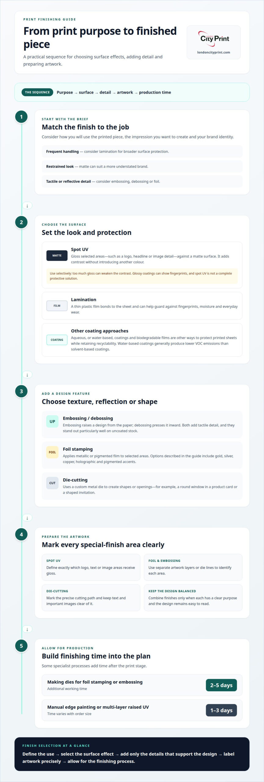
Production time depends on the process. Making dies for foil stamping or embossing typically adds 2-5 working days. Manual edge painting or multi-layer raised UV can add 1-3 days, depending on order size.
Spot UV coating
Spot UV applies a glossy coating to selected areas, then cures it with ultraviolet light. A designer might highlight a logo, headline or image detail while leaving the surrounding paper matte. This contrast adds shine without introducing another colour, so the printed artwork keeps its existing palette. The raised-looking gloss also creates a noticeable change in surface texture.
On a brochure cover, spot UV can draw attention to a small title or brand mark. On a business card, a glossy logo against a matte background creates a focused visual accent. Use it selectively: applying gloss to too many elements can weaken the contrast that makes each detail stand out. Glossy coatings can also show fingerprints, especially on frequently handled surfaces.
Spot UV is a surface effect, not a complete protective solution. For broader coverage, lamination bonds a thin plastic film to the printed sheet and can help guard against fingerprints, moisture and everyday wear. Aqueous, or water-based, coatings and biodegradable films are other ways to protect printed sheets while retaining recyclability. The right choice depends on the desired appearance, handling and material priorities.
For example, a patterned brochure cover could pair a matte base with spot UV over selected shapes. Drip-off varnish creates a related contrast by combining matte and gloss coatings in one process, particularly on imagery and patterned backgrounds. Water-based coatings rely primarily on water and generally produce lower VOC emissions than solvent-based coatings. In the European Union, chemicals used in coatings must comply with REACH regulations.
Keep the finish artwork clear: define exactly which logo, text or image areas receive spot UV. That separation helps preserve the intended contrast during production. For a printed brochure project, explore brochure printing options and plan how the cover finish supports its design.
How do embossing and foil stamping affect print design?
Embossing raises a design from the paper, while debossing presses it inward. Foil stamping applies metallic or pigmented film to selected areas, creating reflective detail. Die-cutting uses a custom metal die to cut shapes or openings. These processes add tactile features and visual distinction to items such as invitations, business cards and brochure covers.
For example, a blind embossed logo has no added colour, but its raised surface catches light across uncoated stock. A debossed border creates the opposite effect, pressing a recessed line into the paper. Foil stamping can add gold, silver, copper, holographic or pigmented accents. A silver foil title on a dark invitation gives the text a distinct reflective finish.
Die-cutting makes the outline part of the design. A round window in a product card can reveal a detail beneath it, while a shaped invitation creates a different silhouette from a standard rectangle. The process needs an accurate cut line in the artwork file. Keep text and important images clear of cut paths so trimming does not remove key content.
Prepare separate artwork layers or die lines to show where foil, spot UV or embossing should appear. For die-cutting, mark the precise cutting path; for foil, identify each area receiving the film. Clear instructions help keep a small logo or fine border aligned with the printed design. Embossing and debossing stand out particularly well on uncoated stock.
You can combine finishes, but each should serve a clear purpose. For a brochure cover, emboss a small logo, add gold foil to a short headline, and die-cut a simple opening. This combination gives the logo tactile depth, the headline a reflective accent and the opening a functional shape. Keep the elements balanced so the design remains easy to read.
Print finishing effects on durability and protection
Finishing can add a protective layer or change how a printed surface responds to handling. Match the technique to the item’s use, such as a menu carried between tables.
Finishes for Durability and Protection
Lamination bonds a thin plastic film to printed material and can help protect it from fingerprints, moisture and general wear. For a menu used throughout service, this layer can help the printed surface withstand repeated handling and occasional spills. It also changes the finish, so consider whether a matte or glossy appearance fits the design. Protection supports durability, but the finish should still suit the material and how people use it.
Finishes for Frequent Handling
Items that pass between people, such as menus or information cards, benefit when you choose finishes to match how people handle them. Lamination can help guard against marks and moisture, while a soft-touch coating provides a velvety texture and protects against blows and scratches. Consider the visual effect too: a subtle matte surface may reduce glare, while gloss adds reflection. Choose the finish that balances practical protection with the impression you want.
For a menu, start by considering how it will come into contact with hands, food and liquid, then select a suitable coating or laminate. A frequently handled card may need a different level of surface protection than a brochure intended for occasional reference. The material, finish and design work together, so compare the desired feel with the need to keep printed details clear.
Finishing techniques affect more than appearance. They add a physical dimension to a printed piece, from the smooth film of lamination to the tactile feel of a soft-touch coating. For example, a matte laminated menu has a restrained surface, while a glossy finish creates stronger reflections. Select protection according to use, then choose a visual treatment that supports the item’s purpose.
Finishes for business cards, brochures, labels, invitations, and packaging
Choose a finish for the product’s purpose, not just its appearance. A different surface suits a business card that you carry in a wallet than an invitation you place inside an envelope. For brochures, labels and packaging, consider how people handle each item and which details should draw attention. A well-chosen finish can enhance the design without competing with its message.
For business cards, matte lamination gives a non-reflective surface, while gloss lamination adds shine and colour intensity. Clients may leave fingerprints on a card they pass around, so consider a matte surface if marks would distract from the contact details. Embossing a small logo adds texture without crowding the name or phone number. Keep the raised detail away from fine text.
A brochure cover can use spot UV on a logo or image against a matte background. On a patterned cover, drip-off varnish combines matte and gloss effects to bring out selected parts of the pattern. For labels, choose a coating that suits the package and the way people will handle the label. Die-cutting can create a custom outline or opening, but the artwork needs a precise cut line.
For invitations, foil stamping can add a reflective accent to a date or heading, while blind embossing gives an uncoloured design tactile depth. Keep these details focused so recipients can still read the event information clearly. Packaging can use the same approach: emboss a simple symbol or foil a short product name. For brands observing design developments in retail packaging south africa and global markets, tactile finishes help products stand out on crowded shelves. Avoid combining too many effects, since each added finish makes production more complex.
Start with the item’s handling and purpose, then select one main surface finish and one detail treatment. For example, pair matte lamination with a small embossed mark on a business card, or use a patterned brochure cover with selective gloss. This keeps protection, legibility and visual interest working together across the finished piece.
Business stationery, brochures and business cards
Business stationery brings a consistent identity to printed materials such as cards and forms. Matching typography, colour and logo placement across letterheads and business cards helps customers recognise your organisation. Choose paper and finishes that suit how you will use each item. A frequently handled card, for example, may benefit from a protective laminate, while an uncoated sheet gives a more understated feel.
Company and product brochures need to organise information into a clear reading sequence. A concise cover can carry the main message, while inside pages explain services, product details or specifications. Booklets and brochures can use folds or binding to suit their page layout and intended format. A matte cover reduces glare; selective gloss can direct attention to a logo or image. Keep headings and body text easy to scan.
Business card printing calls for clear contact details and a layout that remains legible at a compact size. Prioritise the name, role, phone number and email address, then use a finish to support the design rather than compete with it. A restrained foil accent or embossed logo can add a tactile detail, while a simple matte surface keeps the card visually calm. Keep small text away from trim edges.
If a deadline is tight, business cards in one hour offers a rapid production option for a time-sensitive requirement. A finalised design helps keep decisions focused, particularly when you need cards for a meeting or event. For longer documents, plan the brochure format and finishing alongside the content so the printed piece works as one complete communication. The right combination keeps your stationery, brochures and cards aligned with your brand and purpose.
Urgent printing and delivery to your stand
Urgent print work depends on a clear deadline, a production-ready file and a defined delivery point. An overnight printing service can support event teams preparing brochures, posters, legal bundles or display materials against a tight schedule. Share the finished artwork, required quantity, final size and chosen finish together. This gives production a clear brief and reduces avoidable delays caused by missing specifications or late design changes.
Before sending files, confirm the page size, colour setup, image resolution and bleed. Include crop marks where the artwork requires trimming, and keep important text clear of the trim area. A high-resolution PDF helps preserve layout, fonts and image quality. For a last-minute brochure, a finalised PDF and a single approved version help avoid confusion during production.
Delivery directly to your stand can simplify event logistics by sending printed materials to the exhibition location rather than another collection point. Provide the event name, venue, stand number, delivery contact and any access instructions with the job details. For example, a team receiving posters and legal bundles at a conference stand can clearly label each item for quick distribution. Allow for venue handling requirements in your delivery plan.
Urgent printing does not mean every finishing choice suits a compressed schedule. A straightforward trim or fold involves fewer production stages than a job combining lamination, foil and embossing. Select the finish that best supports the material’s purpose, then keep the specification consistent across the order. This helps teams focus on the essentials while maintaining a professional result for meetings, exhibitions and presentations.
Prepare your artwork and delivery details early, then arrange urgent printing with London City Print for event materials that need to reach your stand.
London City Print
London City Print helps you turn a print brief into finished materials that suit their purpose. Its offerings include Booklets and Brochures, Posters, wire binding and Roller Banners. These formats serve different communication needs, from a document you bind for a meeting to a poster or banner for an event. The right choice starts with the audience, display setting and information you need to present.
For a multi-page project, Booklets and Brochures give you a format for arranging content across pages. Plan the reading sequence, image placement and page layout together, then consider how binding supports the way readers will use the document. wire binding suits documents that need to open flat for reference. Keep key text and images away from trim edges so the final layout remains clear.
Posters and Roller Banners serve as visual communication at events, presentations and business settings. A poster can carry a focused message for a wall or display area, while a roller banner presents information vertically. Use a clear headline, strong contrast and concise supporting text. For either format, design around its final dimensions so important content stays visible and legible at viewing distance.
Finishing choices should support the printed piece rather than distract from its message. A restrained surface treatment can suit a formal brochure, while a more prominent visual detail may help an event display attract attention. Keep the design, paper or display format, and intended use aligned. This makes the production brief clearer and helps the final printed item work effectively for its audience.
Prepare your content and preferred format, then contact London City Print to discuss your printing requirements.
Plan Your Next Print Brief
With print finishing options explained, you can move from selecting an effect to defining it clearly in your artwork. Mark the areas for any special treatment, confirm the finished format, and keep the intended use in view. A clear brief gives your design and production requirements a shared reference point, especially when several printed items need to feel consistent.
Before production, bring together your final artwork, dimensions, paper choice, finishing details and delivery requirements. Note which elements should stand out and which need to remain easy to read. This practical preparation keeps decisions focused and gives your print project a clear direction, whether you’re preparing materials for clients, an event or an internal presentation.
If you’re ready to plan a print project, contact London City Print to discuss the formats and finishing requirements that suit your brief. A considered specification is a strong starting point for print that looks purposeful and works for its audience.
Frequently Asked Questions
What is the difference between varnish and lamination?
Varnish adds a thin coating to the printed surface, while lamination bonds a plastic film over it. Aqueous varnish can protect a sheet without adding a separate film, while lamination changes the surface feel and can help guard against moisture and everyday wear. For a product sheet with selected glossy details, varnish offers targeted visual emphasis. For a frequently handled cover, consider full-surface lamination.
What is the difference between embossing and debossing?
Embossing raises a design above the paper surface; debossing presses it into the sheet. For example, an embossed company mark creates a raised focal point on a presentation cover, while a debossed border forms a recessed frame. Both can work without added colour, so the effect depends on light and touch. Keep fine details simple, since intricate shapes may be less distinct when pressed into paper.
What is the difference between foiling and spot UV?
Foiling applies a metallic or pigmented film to selected artwork, while spot UV adds a clear glossy coating to chosen areas. A gold title on an invitation gains colour and reflection from foil; a clear spot UV logo stands out through shine against a matte background. Foil needs artwork identifying its placement, and spot UV also needs a clearly defined application area.
Which finish gives the most premium result?
No finish is automatically the best premium choice, because the result depends on artwork, stock and production method. Selective spot UV can create a polished contrast on a logo without covering the whole surface. Blind embossing adds tactile depth, while foil makes a title reflective. For a restrained design, compare the desired effect and the number of treated areas before combining finishes.
Which finishes should I use for high-durability products like menus?
For a menu handled throughout service, consider full-surface lamination to help protect printed pages from fingerprints, moisture and general wear. A matte laminate reduces reflection under bright restaurant lighting, while gloss adds shine but can reflect overhead lights. Choose a layout with clear text and strong contrast, since the finish should support quick reading as well as surface protection.
What is the difference between gloss, matte, and satin coatings?
Gloss coatings create a reflective surface and can intensify colour, while matte coatings reduce glare with a smooth, non-reflective appearance. Satin sits between these looks, offering a softer sheen than gloss without the flat appearance of matte. For example, gloss can suit a colourful, image-led cover, while matte can help keep text comfortable to read under bright lighting.
What are lamination options for printed materials, and when should each be used?
Matte, gloss and soft-touch lamination offer distinct surface effects. Matte suits documents where glare could distract from text; gloss brings added reflection to image-led covers; soft-touch creates a smooth, velvet-like feel for invitations or premium cards. Consider the lighting and handling conditions too. A glossy brochure displayed under strong lights may reflect more than a matte version, while a tactile invitation benefits from soft-touch.
How do print finishing options affect durability and appearance?
Finishing changes both the surface and the way a printed piece holds up in use. Lamination adds a protective film, while coatings can alter sheen or emphasize selected artwork. A brochure used for frequent reference may need surface protection; an invitation opened once may prioritize texture or reflective detail. Match the process to handling, display conditions and the visual hierarchy of the design.