Let your brochure’s format follow its purpose. To decide how to make a brochure for your business, start with what readers need to understand and do, then choose a fold and layout that make the message easy to follow.
A brochure can introduce your company, explain a product or service, or support a sales conversation. The right format helps organize the information without crowding the page. A tri-fold gives you three panels; a single-fold can work for a simple presentation or a business featuring up to two products or services.
Good design starts with clear priorities. Use your logo and brand colours consistently, choose relevant images, keep text readable, and make the call to action easy to find. Before printing, prepare a high-resolution PDF and check the colour profile, image resolution, bleed, and trim so the finished piece matches your design.
This guide explains how to choose a brochure template and format, structure your content, and add your brand elements. You’ll also learn how brochures can support different business goals and what to prepare for professional printing.
Key Takeaways
- Match the brochure format to your message, audience, and the amount of information you need to present.
- Choose a template that gives your content a clear reading order and suits the fold you plan to use.
- Use your logo, brand colours, relevant images, and concise copy to make each panel work together.
- Plan a clear call to action so readers know what step to take after reading.
- Prepare a print-ready file with the right colour profile, image resolution, and bleed for a polished result.
Can I create my own brochure template?
Yes. Build a template around your message, fold style, and intended use. Then proof the layout and export a file suited to print or digital sharing.
-
Set fold styles and printable panels
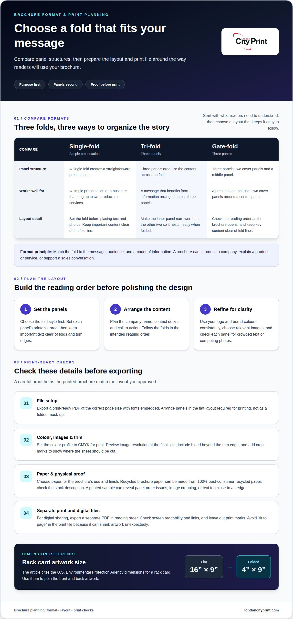
Choose a fold style before placing text or photos. A tri-fold has three panels, while a gate-fold also has three, including two cover panels and a middle panel. A single-fold can suit a simple presentation or a business featuring up to two products or services. Set the panel widths in your template, and keep important text clear of fold lines.
Check the printable area for each panel, not just the flat sheet. A tri-fold’s inner panel should be narrower than the other two panels so it nests neatly when folded. If a rack card suits your message, the U.S. Environmental Protection Agency states that it is 16”x9” flat and 4”x9” folded. Use those dimensions to plan the front and back artwork.
-
Prepare and proof the brochure
Plan positions for the company name, contact details, and call to action before refining the design. Check that the reading order follows the folds, especially when opening a gate-fold or unfolding a tri-fold. Review every panel for crowded text, spelling errors, and photos that compete with the main message.
For print, include bleed beyond the trim edge and crop marks to show where the finished sheet should be cut. Set the colour profile to CMYK for print, and review image resolution at the final size. Choose paper based on the brochure’s intended use and finish. Recycled brochure paper can be made from 100% post-consumer recycled paper; check the stock description before preparing the final file.
Proof a printed sample if the finished fold matters. It can reveal panel-order issues, image cropping, or text that sits too close to an edge. Compare the physical fold with the screen layout before approving the final print file.
-
Export for print or digital sharing
Save a print-ready PDF with fonts embedded and the correct page size. Arrange the panels in the flat layout required for printing, rather than exporting a mock-up of the already-folded brochure. Confirm that bleed and crop marks appear where needed, and avoid “fit to page,” which can shrink artwork unexpectedly.
For digital sharing, export a separate PDF that opens in the intended reading order. Check that text is readable on screen and links work before downloading or sending the file. A digital version can use the same message and photos, but should not rely on print marks or a physical fold to explain the layout.
Name both files clearly, such as “Company-Brochure-Print” and “Company-Brochure-Digital.” Keep the approved version separate from working drafts. Clear file names help you send the correct version for printing or share a clean download with prospective customers.
Choosing a brochure template
Use accurate information for brochure claims, pricing, and contact details, and avoid promises you can’t support. Free or paid design software can produce a professional brochure if it supports your layout and print-ready PDF export.
-
Choose a template to customize
Match the brochure template to your industry, audience, and purpose. A service business may need room for process steps and contact details, while a product business may prioritize descriptions and product photos. Review the template’s panels, reading order, and editable elements before adding content. Avoid designs that leave too little room for your message or force decorative choices that don’t fit your brand.
-
Design with free or paid software
Choose software that gives you control over page size, fonts, colour, and PDF export. Free tools can suit a straightforward company introduction; paid layout software may offer more control over grids and typography. Before choosing a tool, confirm that it can export a high-resolution PDF with bleed and embedded fonts. Keep a working copy so later edits don’t overwrite the approved design.
- Compare templates by how well they help readers find information. For a consultancy, prioritize service explanations and a clear way to get in touch. A café might need space for its menu and location. A product maker may need consistent room for features and descriptions. Use these as starting points, then make the reader’s main decision easy to understand.
Review page dimensions before customizing. Common formats include 8.5 x 11 inches, 8.5 x 14 inches, and 11 x 17 inches. A template designed for 11 x 25.5 inches has a different layout area, so check text flow and image placement before resizing. Select dimensions that suit how people will receive and read the brochure.
- Customize the design in a clear order. Replace sample text with approved content, add your logo and photos, then adjust headings and colours. Remove decorative elements that distract from the message. Check every panel at normal reading size, as small type can be difficult to read in print. When considering how to make a brochure for your business, prioritize useful information over decoration.
Use custom dimensions only when the project needs them. Changing the size can alter panel proportions and text flow. Keep key information inside safe margins and clear of folds and trim edges. Confirm bleed and colour settings before exporting the final file. These checks help catch layout problems before production.
- Save a master template before creating versions for different audiences. Keep versions for prospective customers and existing clients separate when their information differs. Use clear file names, such as “Services-Prospects” and “Services-Clients,” and record the final page size. If you’re considering how to make a brochure for your business, keep the approved artwork and export settings together for consistent updates. This makes future revisions easier to manage.
Bi-fold, tri-fold, and gatefold formats
Common brochure sizes include 8.5 x 11 inches, 8.5 x 14 inches, 11 x 17 inches, and 11 x 25.5 inches. Bi-folds, tri-folds, and gatefolds differ in how they divide the sheet and reveal information.
-
Compare brochure formats and fold types
Choose a format by matching its panels to your content. A bi-fold folds once, creating two panels on each side. A tri-fold folds into thirds, while a gatefold has two cover panels that open onto a middle panel. The Centers for Disease Control and Prevention describes a tri-fold as having six pages when folded. Each format changes the visual sequence and available space.
A bi-fold, for example, can give a company overview room to breathe. A tri-fold can guide readers through services in a set order. A gatefold can reveal a central message between its opening panels. Match the fold to the amount of content instead of squeezing text into every available area.
-
Select a brochure fold
List the information readers need, then assign one main idea to each panel. Choose a bi-fold for a short introduction with a clear front and inside spread. Select a tri-fold when readers should move through several related points. Use a gatefold when opening the cover panels should reveal one central visual or message.
Check the format against how you’ll distribute the brochure. A handout for a meeting may need to be easy to scan, while a brochure kept for reference can include more detail. Consider portability, too: a compact folded piece can fit easily into a bag, but dense copy still needs comfortable reading space. Remove content that doesn’t support the brochure’s purpose.
-
Check safe zones and fold lines
Mark each fold line in the design file before placing headings, logos, or contact details. Keep essential text inside safe zones, clear of folds and trim edges. A fold can interrupt a word or shift the visual balance, so avoid placing a face, product detail, or key message directly across it.
Review a full-size test layout by folding a plain sheet into the chosen format. Label the panels, then confirm the front cover, inside reading order, and back panel. For a tri-fold, make the inner panel narrower so it nests neatly. This practical check catches layout problems before brochure printing.
Adding logos, brand colors, images, text, and icons
Build a consistent visual system across every panel. Your logo, colours, copy, and graphics should support one clear message and action.
- Place your logo where readers can identify your business quickly, such as on the cover and contact panel. Use the same approved logo version throughout, and keep its proportions intact when resizing. Apply brand colours to headings, dividers, and buttons, then check contrast against each background. For example, dark blue text on a pale background is easier to read than low-contrast shades.
- Choose images that explain the offer rather than simply decorate the page. A photo of a finished product can help readers understand its scale, while a team photo can add context to a service introduction. Use only images you own or have permission to use. Keep the subject clear at the final print size, and avoid stretching images or cropping away meaningful details.
- Write copy for the panel where it appears. Give the cover one main promise, use inside panels for supporting details, and reserve the final panel for contact information or a next step. For example, a service brochure can pair a short benefit statement with a brief process overview. Remove repeated claims and long paragraphs so readers can scan the design without losing the main point.
- Make the call to action specific. Use a direct instruction such as “Book a consultation” only if it fits your business process. Place the relevant phone number, email address, or contact page beside it. If you want readers to request information, make that next step easy to find on the panel they see last.
- Use icons and graphics to clarify categories, not just fill empty space. A location pin beside an address or a phone symbol beside a number can help readers find details. Keep icon styles consistent, and pair each symbol with words so its meaning is clear. Limit decorative graphics that compete with your logo or call to action.
- Check image resolution at the size each item will print. Enlarging a small image can soften its edges, while a sharp original can retain detail in the final layout. Review the PDF at full size, then inspect colours, logo placement, and text across every panel. A final check should catch inconsistent type styles, missing contact details, and graphics that overlap important copy.
Business uses for brochures
Give each brochure one business purpose, then shape the layout around it. A product guide, event handout, and customer welcome piece each need different content priorities.
- Use a company profile to introduce your business to prospective clients. Highlight what you do, who you serve, and why your approach is relevant. For example, a design firm could use one panel for its process and another for selected project examples. Keep claims specific and direct readers toward one next action, such as arranging a conversation.
- Build a product brochure around a buying decision. Group related products, explain their uses, and make meaningful differences easy to compare. A supplier might dedicate a panel to product features and another to ordering information. Describe each item consistently so readers can browse the range without searching through unrelated details.
- Prepare event brochures to answer visitors’ questions on site. A conference handout can introduce your services, explain a demonstration, and provide contact details for follow-up. Put essential information near the front, where attendees can find it quickly. Match the layout to the event setting, especially if people will read while standing or moving.
- Create a customer guide when people need clear instructions after a purchase or meeting. Use a step-by-step layout for setup, care, or service processes. For example, a training provider could outline preparation, session topics, and follow-up resources. Add headings that help readers return to a specific instruction without rereading every panel.
- Use a sales leave-behind to support a conversation, not repeat a full presentation. Select the points prospects need to remember, then organize them in the same order as the discussion. A short case example can make a service easier to understand, while a clear contact section gives readers a useful reference after the meeting.
- Plan brochures as part of a coordinated campaign. Pair a printed handout with a digital version, business cards, or event materials when each item supports the same message. Keep names, colours, and contact details consistent across the set. Review the materials together so readers recognize your business at every point of contact.
Choose the format and production approach that fit the intended use, then prepare the artwork for its final setting. Arrange brochure printing for a finished piece that supports your next customer conversation.
London City Print: Booklets and Brochures
London City Print produces Booklets and Brochures for company information, product details, and customer handouts. Turn to the team when your design is ready for professional print production or you need help bringing your brochure project to its finished format.
You can coordinate brochures with supporting materials such as Business Cards or Posters. If your project needs pages held together in a booklet, wire binding is another option. Prepare your artwork and decide how readers will use the finished piece, whether at a meeting, event, or customer visit.
Contact London City Print to discuss your brochure project and the format you need.
Put Your Brochure to Work
For a coordinated set of printed materials, London City Print offers Booklets and Brochures, Posters, and wire binding. These options support different communication needs, from a compact company introduction to a bound document or event display. Choose the format that fits the task, then prepare the artwork for production.
Contact London City Print to discuss your brochure project. With a clear purpose and a well-prepared design, you’re ready to put your business message into readers’ hands.
Frequently Asked Questions
What are the best practices for designing a brochure?
Start with the reader’s main decision, then make the next step easy to find. For a business launching a new service, lead with the customer need, explain the offer, and include a relevant way to get in touch. Keep terminology consistent across panels and avoid claims you can’t support. Before distribution, review a printed copy under normal lighting and check that names, contact details, and calls to action are legible.
How do I make my brochure double-sided?
Create the front side first, then duplicate the project or page to build the reverse. Use the original as a guide for page size, margins, colours, and alignment. Add new content to the back rather than simply repeating the front. Before exporting, confirm that the pages print in the intended orientation and the reverse artwork aligns with the finished sheet.
What is the standard brochure size?
There isn’t one universal size for every brochure. A commonly used standard is 8.5 x 11 inches, while 8.5 x 14 inches and 11 x 17 inches are also standard options. Choose based on how much content you need and how readers will handle the piece. A compact handout may suit a brief introduction; detailed product information may need more room.
Are brochures and pamphlets the same thing?
They’re similar printed materials, but people often use the terms for different purposes. A brochure commonly presents a business, service, or product in an organized format. A pamphlet often focuses on one subject or message, such as an informational campaign. The labels can overlap in everyday use, so make the purpose clear through the title, content, and design rather than relying on the name alone.
What does a brochure look like?
A brochure is a printed or digital information piece with a planned sequence of sections. It may be a folded sheet with separate panels or a multi-page booklet. For example, a company introduction might open with its name and offer, then provide supporting details and contact information. Typography, colour, and imagery should work together to help readers recognize sections and follow the content.
What should brochures include?
Include a clear title, useful information for the intended audience, relevant visuals, and a next step. A product brochure might include product names, descriptions, and a way to request details. An event handout could give the event name, key information, and a contact point. Include only content that supports the brochure’s purpose, and check that names and contact details are current.
Why are brochures important for marketing?
Brochures give customers a portable reference they can revisit after a meeting, event, or introduction. A well-planned piece can explain an offer in a clear sequence, answer common questions, and make follow-up details easy to keep. For example, a sales team can leave a focused service guide with a prospective customer. It works best as part of a wider communication plan.
What information should a business brochure include?
Prioritize the details a prospective customer needs to understand your business and decide what to do next. Include your company name, a plain-language description of your offer, relevant benefits, and accurate contact information. Add a concise company background only when it helps explain your expertise or approach. For a brochure about a specific service, include the details that distinguish it from your other offerings.