
A visually striking design means nothing if your text dissolves into an unreadable blur from two metres away or your artwork fails pre-flight file checks minutes before production. Creating an effective informational poster requires pairing a disciplined visual hierarchy with exact reprographic specifications. You already know how stressful it is to battle overcrowded sections, unexpected colour shifts, and harsh overhead venue glare when a hard commercial deadline is fast approaching.
You don’t need to leave presentation quality to chance or lose valuable turnaround time to preventable file errors. In this guide, you’ll discover how to structure, design, and print high-impact informational posters that communicate complex details with absolute technical precision. We examine every stage of the production process, from establishing accurate CMYK values and bleed margins to selecting durable, eco-conscious stocks with a B1 fire rating that satisfy strict venue standards while keeping your rollout firmly on schedule.
Key Takeaways
- Master three-tier visual hierarchy and structured scanning paths to design an informational poster that remains legible from several metres away.
- Prevent costly production delays by preparing high-resolution PDFs with correct CMYK colour profiles, accurate bleed margins, and crop marks.
- Select glare-free satin or matt finishes on eco-conscious stocks to maintain text legibility under harsh commercial lighting.
- Verify venue safety compliance by choosing print materials that meet certified B1 fire rating standards.
- Rely on thorough pre-flight file checks to catch resolution issues and scaling errors before running large-format prints up to A0 and beyond.
What Is an Informational Poster and Where Does It Work Best?
While standard historical definitions outline what a poster is as a printed sheet affixed to a vertical surface, an informational poster serves a distinct operational purpose. It communicates instructional, educational, or procedural data with immediate visual clarity. Unlike transient retail advertising that pushes impulse sales, informational graphics prioritize visual legibility, public compliance, and fast comprehension.
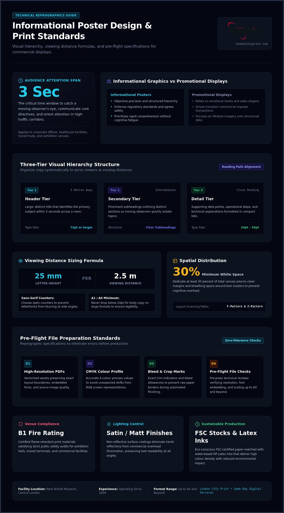
You encounter these displays in corporate offices, medical clinics, research universities, transit hubs, and exhibition venues. In these busy corridors, people are on the move. You only have roughly three seconds to catch their eye and direct their attention. A well-engineered layout ensures that viewers understand primary instructions immediately without breaking their stride.
Key Functions of Effective Informational Graphics
An effective graphic translates dense data into clean, structured summaries that readers can digest under pressure. These displays solve critical operational hurdles across commercial facilities by handling three core functions:
- Streamlining technical workflows: Breaking complex operational sequences into numbered segments, icons, and digestible data points.
- Enforcing regulatory standards: Displaying mandatory health protocols, site policies, and emergency egress maps that pass safety audits.
- Wayfinding and orientation: Directing visitors through corporate campuses, sprawling trade exhibitions, and transit terminals.
Informational Posters Versus Promotional Displays
Promotional graphics rely on emotional hooks, bold lifestyle photography, and punchy sales slogans to prompt an immediate transaction. Informational posters demand objective precision, structured hierarchy, and functional typography. Your goal isn’t to entertain; it’s to inform without causing confusion.
Crowding your layout with decorative flourishes causes cognitive fatigue. When viewers face a cluttered canvas, they walk away. Leaving intentional margins and generous white space around your text blocks allows the eye to isolate crucial directives. That spatial discipline keeps technical specifications legible, clean, and visually authoritative across any busy commercial setting.
Core Design Rules: Establishing Hierarchy, Typography, and Layout
A successful informational poster relies on an intuitive reading pathway. Most viewers scan physical displays using an F-pattern or Z-pattern, sweeping across the top before tracking down the left margin. When you align your content with these natural eye movements, you help readers absorb complex information rapidly without losing their place.
Contrast ratios must meet established accessibility standards to keep your text readable under inconsistent ambient lighting. Pair high-contrast elements, such as dark charcoal text on a clean, neutral background, and limit your design to two complementary font families. Sticking to a dependable serif and sans-serif pairing prevents visual chaos while preserving institutional authority.
Structuring Three Tiers of Information
Organize your copy into three distinct visual tiers to serve viewers at varying distances:
- Header tier: Set large, clear titles that identify the subject from five metres away within three seconds.
- Secondary tier: Use prominent subheadings that outline sections so moving observers can find relevant topics quickly.
- Detail tier: Present your supporting data, steps, and technical explanations in compact bullet points for close reading.
Typography and Viewing Distance Formulas
Readable text requires strict sizing formulas linked to expected viewing distance. As a standard baseline, allocate roughly 25 millimetres of letter height for every 2.5 metres of viewing distance. Set your main headlines at 72pt or larger so they remain visible across an entire room.
Keep your body copy between 24pt and 36pt. If you drop below 24pt on an A1 or A0 sheet, casual readers will simply ignore your text. Choose clean sans-serif typefaces with open counters to prevent letterforms from blurring together when viewed from side angles.
Using White Space, Data Tables, and Icons
Dense technical blocks quickly cause visual fatigue. Dedicate at least 30 percent of your total canvas area to clean white space around text clusters and diagrams. This spatial margin creates breathing room, allowing viewers to isolate individual sections without effort.
Replace multi-variable graphs with streamlined tables or single-metric charts. Universal pictograms work well alongside short sentences to clarify complex technical steps. Before sending your design to press, reviewing best practices for preparing print-ready files ensures your carefully balanced typography and visual margins reproduce accurately on physical substrates. If you need help refining your artwork before production, consult London City Print for guidance on achieving the sharpest layout results.
Technical Print Preparation: Turning Digital Files into Print-Ready Assets
A digital mockup that looks sharp on an LED monitor can easily fail on an industrial flatbed or roll-fed press. Producing a high-impact informational poster requires strict prepress standards. You must configure your canvas using precise metric dimensions, such as A2 (420 x 594 mm), A1 (594 x 841 mm), A0 (841 x 1189 mm), or tailored custom dimensions. Once dimensions are set, build your document directly in the CMYK colour space. Leaving files in RGB forces automated press conversions that turn clean blues and rich greens into muddy, desaturated tones.
Every commercial production run involves slight mechanical shifts during the finishing process. Exporting high-resolution PDFs with flattened transparency layers and converted vector type eliminates rasterization errors, keeping text razor-sharp across all production equipment.
Setting Bleed, Margins, and Crop Marks
Mechanical guillotines require tolerance. When setting up your artwork, follow three essential layout boundaries to prevent trimming flaws:
- Extend a 3mm bleed: Pull all background fills, boundary lines, and full-bleed graphics 3mm past the final trim edge. This eliminates hairline white borders if the blade shifts.
- Maintain a 10mm inner margin: Keep body copy, logos, and critical diagrams 10mm inside the trim line to prevent edge clipping.
- Embed standard crop marks: Include hairline trim marks offset outside the bleed area. Never select “fit to page” when exporting or sending files to print, as this scales your artwork unpredictably and skews technical margins.
Debunking the 300 DPI Myth on Large Formats
Desktop stationery and handheld brochures require 300 DPI because readers hold them 30 centimetres from their eyes. Applying this rule to large-format graphics is the classic 300 DPI myth. For an A1 or A0 display viewed from one to three metres away, a file prepared at 150 DPI produces crisp, indistinguishable visual output on commercial substrates.
Forcing a large-format poster into 300 DPI inflates file sizes into gigabytes without improving perceived print sharpness. These bloated assets slow raster image processors (RIPs) and cause transfer bottlenecks. Setting your raster assets to 150 DPI at 100 percent scale preserves technical precision while streamlining data processing.
Pre-Flight File Checks and Color Management
Catching formatting mistakes before ink touches paper saves both time and materials. Run thorough pre-flight file checks to verify that every font is outlined, raster images maintain adequate DPI, and all colour swatches map to CMYK rather than spot pantones or RGB screen values.
If you’re managing complex charts or color-critical corporate diagrams, request digital samples before approving full production runs. Verifying a physical proof allows you to inspect linework density, contrast ratios, and colour accuracy under actual site lighting.
Choosing Substrates, Materials, and Finishes for Commercial Displays
A flawless visual layout quickly loses authority if printed on flimsy paper that curls, ripples, or reflects harsh room lighting. Selecting the correct substrate determines your graphic’s durability and visual clarity. When your informational poster hangs in a busy conference hall, hospital corridor, or retail lobby, the tactile weight and physical finish work together to maintain complete readability throughout its display lifecycle.
Modern commercial venues also enforce strict fire and environmental compliance standards. Matching your design to certified paper stocks guarantees that your installation looks professional while passing on-site safety audits without friction.
Paper Weights from 170gsm to Rigid Boards
Poster substrates range from flexible roll media to rigid display panels:
- 170gsm to 200gsm satin paper: An ideal weight for standard snap frames and lightboxes. It stays flat behind acrylic covers without bunching or wrinkling.
- 250gsm premium poster paper: Provides structural stability for hanging rails and magnetic poster hangers, preventing unsightly corner curling in high-traffic hallways.
- Rigid mounted boards: For standalone presentations and easel displays, choose sturdy display panels or explore foam board printing to keep your exhibits completely flat and self-supporting.
Surface Finishes: Matt Versus High-Gloss Finish
While a high-gloss finish makes marketing graphics look bold by boosting colour saturation, it creates severe surface reflections under bright overhead fluorescents. That glare easily blinds viewers trying to read small-format tables and instructional text blocks.
Matt finishes absorb light completely. They provide non-reflective surfaces that keep complex data charts legible from wide angles. Satin finishes bridge the gap by offering rich colour reproduction alongside controlled light diffusion, making satin a dependable choice for corporate communications.
Safety Ratings and Eco-Conscious Stocks
Public venues, exhibition centres, and transit hubs frequently mandate that display materials hold a certified B1 fire rating under DIN 4102-1 standards. This flame-retardant classification confirms that your posters will not accelerate fire spread, helping event organizers meet commercial building regulations.
Corporate procurement teams also require verifiable environmental credentials. Selecting eco-conscious stocks and FSC-certified paper produced via responsible forestry aligns with organizational sustainability targets. Printing these stocks with water-based HP Latex inks eliminates harsh chemical odours and volatile organic compounds (VOCs). If you need certified materials printed to exact corporate standards, order your custom posters with London City Print for rapid turnaround and dependable quality control.
Executing Your Print Project with London City Print
Operating since 2009, London City Print delivers dependable reprographic production right from Central London near the British Museum. Large-format graphics demand tight mechanical oversight. Our facility produces precision prints up to A0 and beyond, tailoring output to your exact custom dimensions. Digital printing is most efficient for short runs under 500 units, giving you rapid turnaround without sacrificing crisp linework or colour density.
When you present research or launch major corporate initiatives, an informational poster works best alongside tactile collateral. You can reinforce your display panels by distributing bound handouts or professional booklets and brochures that provide visitors with in-depth technical data to take away.
Pre-Press Assurance and File-Checking Service
Automated software often misses subtle formatting flaws that ruin physical prints. Our dedicated file-checking service reviews your high-resolution PDFs before production begins. Technicians inspect your asset setup to eliminate technical headaches:
- Margin and bleed verification: Confirming proper 3mm bleed limits and verifying 10mm inner safety zones to protect critical text.
- Colour space auditing: Identifying unintended spot inks or RGB assets and converting them to press-ready CMYK profiles.
- Scale corrections: Checking native vector geometry to ensure true technical precision across large formats.
We supply digital proofs promptly so you can confirm dimensions and typography prior to the print run.
Same-Day Turnaround for Urgent Corporate Deadlines
Conferences and trade summits rarely follow relaxed schedules. Located minutes from major transit links, London City Print handles urgent corporate deadlines with same-day service for most professional documents. Whether you need sudden replacement graphics, supplementary business stationery, or urgent updates to compliance signage, our team meets your delivery windows.
If you’re managing complex multi-item exhibits under tight time constraints, you can consult our commercial printing specialists. We ensure that every display asset matches corporate branding guidelines across multiple media types.
Custom Finishing and Rigid Display Options
Post-print treatments protect your visual investment from wear and tear. You can select custom finishing options including protective encapsulation, matt lamination to counter indoor lighting, or neat edge trimming. For free-standing presentation boards, we mount prints directly to lightweight rigid display panels tailored to your exhibition frames.
Extend your visual footprint further by coordinating structural displays with branded vinyl window graphics. Aligning your large-format informational poster with architectural glazing creates an immersive, authoritative environment across your entire commercial facility.
Bring Absolute Reprographic Precision to Your Next Poster Project
Designing an effective informational poster requires more than aesthetic balance. You need an organized three-tier layout that viewers can digest in seconds, backed by exact prepress standards like 3mm bleed margins, CMYK colour profiles, and glare-free finishes. Pairing deliberate visual hierarchy with B1 fire-rated, eco-conscious paper ensures your message remains legible, durable, and venue-compliant in any busy space.
Operating in Central London since 2009, London City Print removes production friction from urgent commercial deadlines. Our reprographic specialists run thorough pre-flight file checks to catch resolution faults and scale discrepancies before ink meets paper. Whether you require standard sizes up to A0 or tailored custom dimensions, our team delivers pristine large-format prints with dependable same-day turnaround.
Don’t let preventable file errors derail your event rollout. Send Your Poster Files for Expert Review at London City Print today and ensure your next display makes an immediate, professional impact.
Frequently Asked Questions
What is an informational poster used for?
An informational poster communicates operational guidelines, educational data, public health notices, or event navigation with immediate clarity. Unlike promotional graphics designed to generate commercial sales, these posters focus on rapid reader comprehension in busy foot-traffic zones. You’ll find them deployed across medical clinics, corporate headquarters, transit hubs, and academic environments to ensure public compliance and smooth facility operations.
What is the best font size for an informational poster?
The best font size depends on your viewing distance, but headlines should measure at least 72pt to remain legible from five metres. For secondary subheadings, set type between 36pt and 48pt so walking viewers can quickly scan the core topic. Body copy and detailed notes should remain between 24pt and 36pt. Anything under 24pt becomes difficult to read on large-format sheets like A1 or A0.
Does an informational poster really need 300 DPI resolution?
No, large-format graphics don’t require 300 DPI because people view them from greater distances. While handheld stationery demands 300 DPI, an informational poster printed at A1, A0, or custom dimensions looks completely sharp at 150 DPI when viewed from one to two metres away. Designing at 150 DPI prevents massive, unwieldy file sizes that bog down pre-press software while maintaining exact reprographic clarity on commercial presses.
Which paper finish works best for posters in brightly lit offices?
Matt and satin finishes work best for brightly lit offices because they diffuse overhead glare. A high-gloss finish creates harsh reflections under fluorescent fixtures and spotlights, making text clusters and detailed tables unreadable from side angles. Selecting a 170gsm to 250gsm satin or matt stock keeps contrast sharp, colours balanced, and typography readable throughout corporate workspaces.
How much bleed should I include on my print file?
You must include a minimum 3mm bleed around the outer perimeter of your artwork. Extending background colours and imagery 3mm past the trim line ensures you won’t get unsightly white borders if mechanical guillotine blades shift slightly during cutting. In addition to the bleed, keep all critical text and logos 10mm inside the trim line within a safe margin zone.
Can London City Print review my file before running the print?
Yes, our technical team conducts rigorous pre-flight file checks before sending any artwork to the presses. We inspect your files for correct 3mm bleed margins, font vectorization, image resolution, and proper conversion to the CMYK colour space. If our technicians detect potential issues, we alert you immediately or correct scaling errors so your job runs with technical precision.
Can I get large-format informational posters printed on the same day?
Yes, London City Print provides reliable same-day turnaround for large-format orders placed from our Central London production facility. Located near the British Museum, our shop specializes in fast-response commercial production for urgent event and corporate deadlines. We print, finish, and trim formats up to A0 and beyond on short notice, ensuring you receive press-ready display materials right when you need them.