A catalogue’s production plan starts with its format, page count, paper, binding and print quantity. For art gallery catalogue printing, these choices also affect how artwork reproduces and how the finished publication handles in storage, at an exhibition or in the post.
You need a catalogue that presents the work clearly and is ready for its intended use. The right specifications depend on your images, layout, distribution plan and deadline, so settle the key decisions before production begins.
This guide explains how to choose a size and binding, prepare high-resolution PDFs with suitable colour settings and bleed, and plan production and shipping. You’ll also learn how project details shape the production plan, helping you prepare a clear brief and understand the effect of each choice.
Key Takeaways
- Choose a binding style that suits the catalogue’s page count, handling needs and presentation.
- Set the page count, paper and finish around the artwork and the way readers will use the catalogue.
- Select a trim size that supports the layout, image proportions and practical distribution needs.
- Prepare print-ready files with the correct dimensions, colour settings, bleed and crop marks to reduce production issues.
- Plan production and delivery around your event date, and use booklet and brochure printing support when you need a finished catalogue.
Binding options for art catalogues
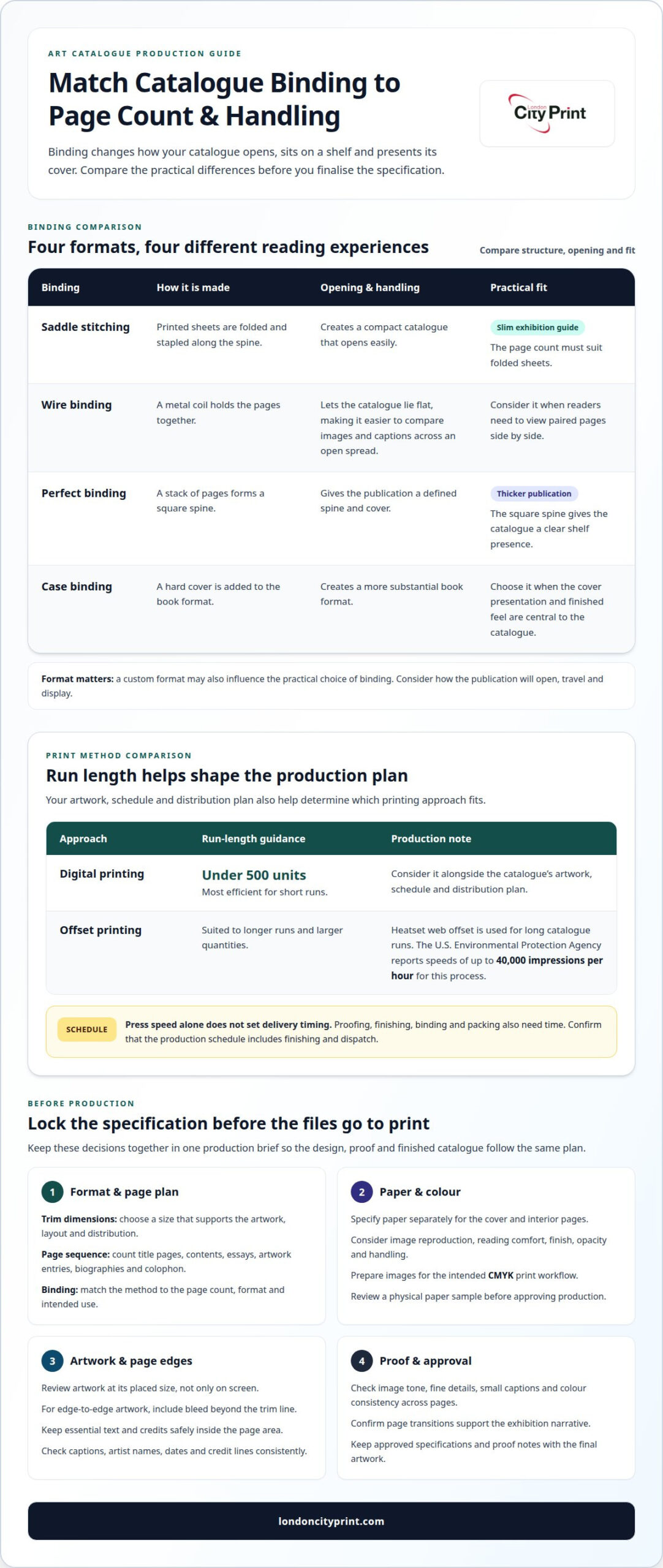
Choose a binding that supports your page count, format and intended use. Digital printing is most efficient for short runs under 500 units. Offset printing suits longer runs, where a consistent production process can handle larger quantities. Your artwork, schedule and distribution plan help determine which approach fits.
For a slim exhibition guide, saddle stitching folds printed sheets and staples them along the spine. It creates a compact catalogue that opens easily, but the page count must suit folded sheets. Wire binding holds pages with a metal coil and lets the catalogue lie flat, making it easier to compare images and captions across an open spread.
Perfect binding creates a square spine from a stack of pages, making it suitable for a thicker publication. Case binding adds a hard cover for a more substantial book format. Each method affects how the catalogue opens, sits on a shelf and presents its cover design. A custom format may also influence the practical choice of binding.
Printing method and binding work together. According to the U.S. Environmental Protection Agency, heatset web offset printing is used for long runs of catalogues at speeds of up to 40,000 impressions per hour. That production speed does not set your delivery schedule by itself. Finishing, binding, proofing and packing also need time.
When choosing an art catalogue printing company, look for clear guidance on file preparation, colour reproduction, proofs and binding. Ask how the production team will assess the artwork, paper and finishing as a complete specification. A physical proof can help you review image tone and paper feel before approving the run. Confirm that the schedule includes finishing and dispatch.
Image permissions depend on the artwork and the rights holder’s terms. Secure reproduction permission and follow any required credit wording before sending files to print. For reader access, use legible type, strong text contrast and clear captions. If you also publish a digital edition, plan its accessibility separately from the printed copy.
Include the exhibition or collection title, gallery name, dates, curator or author, artwork titles, artists, captions and image credits. Add an introduction, checklist or essays when they support the publication’s purpose. The Internal Revenue Service describes a museum determining reproduction proportions from the original artwork’s form and attending to other technical aspects. Apply the same principle when placing images: preserve proportions and review each reproduction at its final printed size.
Page counts and print specifications
Set the page plan before finalising the catalogue design. Count every printed page, including title pages, contents, essays, artist biographies, artwork entries and colophon. Include any blank pages required by the layout so the final document sequence matches the approved design. A page map helps editors track content and prevents captions or credits from drifting away from their artworks.
Build a page map with a clear order: opening material, curatorial text, artwork sections, supporting information and closing credits. Give each artist a consistent entry style. For example, an artwork entry might pair the title and date with medium, dimensions, collection details and a caption. Keep labels consistent throughout the catalogue, even when artists have different numbers of works.
Choose paper by considering both image reproduction and reading comfort. Coated stock can present colour images with a smoother surface, while uncoated stock can give text pages a softer, less reflective feel. Specify paper separately for the cover and interior pages. Note the finish, opacity and handling requirements, then review a physical sample before approving production.
Record print specifications in a single production brief. Include finished trim dimensions, page sequence, cover treatment, paper selections, colour requirements and any special finishing. State whether images run to the edge or sit within a border. Edge-to-edge artwork needs bleed beyond the trim line. Keep essential text and credits safely inside the page area.
- Page order: Match the approved contents list to the final PDF sequence.
- Colour: Prepare images for the intended CMYK print workflow.
- Image quality: Review artwork at its placed size, not only on screen.
- Text: Check captions, artist names, dates and credit lines consistently.
A production proof can reveal issues that a screen review misses. Check image tone, fine details, small captions and colour consistency across adjacent pages. Confirm that page transitions support the exhibition narrative. For example, a dark image beside a pale one may need a layout adjustment to preserve visual balance.
Keep the approved specifications with the final artwork and proof notes. This gives editors, designers and production teams a shared reference. Clear page mapping and complete specifications help prevent avoidable corrections late in the schedule, especially when several artists, image sources and editorial contributors are involved.
Print sizes
Choose a trim size based on the artwork, reading distance and how visitors will handle the catalogue. A portrait format suits a publication with essays and vertical works. A landscape format gives wider images more room, especially alongside captions or comparison details. For mixed artwork, test representative pages before settling on the final dimensions.
Start with the largest image and the smallest supporting text. Set a page size that gives each work enough space without shrinking captions or leaving awkward gaps. A full-page painting, panoramic photograph and detailed installation view each need a different layout. Review sample spreads at their intended size, not only on a computer screen.
Consider how the finished catalogue will travel and display. A compact format can fit easily into a visitor’s bag, while a larger page can give artwork greater presence. If the publication needs custom dimensions, check that the chosen format still suits the binding, storage and distribution plan. Large-format printing can extend to A0 size and beyond.
- Portrait: Consider this for text-led layouts, artist biographies and vertical artwork.
- Landscape: Use it when wide images or paired comparisons guide the reading experience.
- Square: Assess it for balanced image grids and collections with varied orientations.
- Custom dimensions: Match a distinctive design, then confirm its production practicality.
Check image proportions before scaling artwork to fill a chosen page. Cropping can remove meaningful details, while stretching distorts the original. Keep a consistent image area across related works, but allow exceptions when an installation or panoramic piece needs different treatment. Place captions close to their images so readers can identify each work clearly.
Print size also affects the relationship between image resolution, type size and page layout. Enlarge a proof to its final trim dimensions and inspect fine lines, signatures and small labels. If a title looks cramped, adjust the layout rather than relying on automatic fit to page. That setting can shrink the design unexpectedly and create inconsistent margins.
Before approving the format, check a sample containing the cover, a text page, a full-page image and a spread. Confirm trim edges, margins, image placement and legibility. Review the folded or bound catalogue in hand, too. A size that looks striking on screen must still open comfortably and suit the exhibition’s intended use.
Print-ready file setup and templates
Build the catalogue file to the final trim size, using the printer’s template for page dimensions, bleed and safe areas. Extend artwork that reaches an edge beyond the trim line. Place titles, captions and credits inside the safe area, where trimming cannot cut them off. A high-resolution PDF preserves layout, fonts and image quality for printing.
Use one page per PDF page, in reading order. Keep cover files separate if the template requests them. Check that the cover design accounts for the spine and back cover. Without a spine allowance, cover artwork or text can shift. Follow the template’s page order and do not add printer spreads unless production requests them.
Before exporting, check the following production details:
- Colour profile: Convert images to the agreed CMYK workflow. RGB files can reproduce differently in print.
- Fonts: Embed fonts in the PDF or outline them when appropriate. This prevents substitutions that alter line breaks.
- Images: Review resolution at the image’s placed size. Enlarging a small image can make details look soft.
- Trim and bleed: Include crop marks only as specified by the template. Keep marks outside the finished page area.
Artwork reproduction can suffer from low-resolution files, incorrect colour profiles, missing fonts, accidental cropping or stretched proportions. Prevent these problems with pre-flight file checks, a correctly sized PDF and a proof review. Compare key images with approved references, and inspect fine detail, tonal range and colour balance before production.
Templates also help keep repeated elements consistent across artist pages. Set consistent positions for image captions, artwork titles, dates and credit lines. Use paragraph styles for headings and body text instead of formatting each entry separately. A single style change can then update the catalogue without shifting individual pages unpredictably.
Export the final PDF using the template’s settings, then inspect every page at full size. Check page order, blank pages, image placement, links, captions and bleed. Open the file on another device to catch display issues. Keep the approved PDF and proof notes together so the production version stays distinct from working drafts.
Production and shipping timelines
Work backwards from the exhibition opening or catalogue launch. Set the delivery deadline first, then map each production stage against it. The schedule needs room for final artwork, proof approval, printing, binding, packing and transport. A catalogue for an opening reception must arrive before staff prepare tables and visitor materials.
Start with a complete production brief. Include the approved page count, trim size, paper, binding, print quantity and delivery address. Confirm who approves the proof and how they will return feedback. If several curators or artists need to review the pages, agree on one decision-maker. Consolidated comments help prevent repeated revisions from delaying the next stage.
Proofing sits between file preparation and production. Allow time to review image colour, captions, page order and finishing details. Correcting an artist credit may require a new proof, while changing a major image can affect the layout across several pages. Approve the final version explicitly and keep earlier drafts separate from production files.
Printing and finishing take different amounts of time depending on the chosen process, quantity and specification. Digital printing is most efficient for short runs under 500 units. Longer runs may use heatset web offset printing, followed by binding and finishing. Complex cover treatments or custom formats add production steps, so include them in the schedule before confirming delivery.
Shipping also needs a clear plan. Provide the full delivery address, receiving contact, access instructions and any opening-hour restrictions. For multiple destinations, label quantities by location and pack them separately. For example, copies for a gallery shop and an exhibition space should have distinct carton labels and delivery details.
- Before production: Finalise files, specifications and proof approval.
- During production: Track printing, binding and finishing as separate stages.
- Before dispatch: Confirm carton quantities, labels and receiving arrangements.
Keep the event date visible in every production conversation. If artwork or approvals change, revise the schedule promptly rather than assuming the original dispatch plan still fits. For a catalogue that must reach a particular venue, build the plan around its receiving process and allow time to resolve address or access issues. Plan your catalogue production and delivery around the date your readers need it.
London City Print
London City Print produces gallery publications as booklets and brochures, helping you turn an approved design into printed copies for an exhibition, collection or gallery programme. Bring together the publication’s purpose, format, page sequence, artwork and intended delivery date. A clear brief gives production a practical starting point and keeps key decisions together.
Your chosen format should serve readers as well as the artwork. A catalogue with essays and captions needs comfortable reading, while an image-led publication may need space for larger reproductions. Decide how visitors will handle and keep it, then choose the design and binding accordingly. Wire binding can suit publications that need to lie flat during viewing.
To prepare a clear brief, gather the core project details:
- Publication: State whether you need a gallery booklet or brochure.
- Artwork and content: Organise images, captions, text and credits in final page order.
- Format: Specify the finished dimensions, paper choices and binding direction.
- Schedule: Share the exhibition date and delivery arrangements.
Keep the approved artwork separate from drafts. Include the final PDF and any notes that affect reproduction, such as image placement or colour references. If you have a physical proof, use it to communicate the qualities you want the finished catalogue to retain. This gives the production discussion concrete material to work from.
Gallery print needs can extend beyond the catalogue itself. Posters can communicate exhibition details inside the venue, while roller banners can help identify an event area. Treat these as supporting pieces with their own dimensions and artwork, rather than assuming the catalogue layout will transfer unchanged. Consistent titles, colours and imagery can help connect the materials.
London City Print’s booklet and brochure printing suits galleries that need a bound or folded publication for visitors. wire binding is another option when a catalogue needs to open flat. Share your final content, preferred format and event schedule to make the production requirements clear from the outset. For related exhibition materials, define each item separately and match its artwork to its intended use.
Contact London City Print to discuss your gallery catalogue requirements.
Move your gallery publication into production
Your art gallery catalogue printing project can shape how visitors experience an exhibition. Consider how the publication will work alongside the gallery’s other printed materials. A coordinated approach can help visitors connect the catalogue with exhibition information and supporting displays.
London City Print offers Booklets and Brochures for gallery publications, plus Posters for exhibition communication. wire binding is also available for catalogues that need to open flat. Decide which pieces you need, then bring their purpose, artwork and final formats together in one clear project brief.
A practical next step is to gather the approved content and note how each printed item will be used. This gives your production conversation a clear direction without locking you into unnecessary design choices. Contact London City Print about catalogue printing to discuss your project. With a clear brief, you can move forward with confidence and prepare a considered publication for your visitors.
Frequently Asked Questions
What information should I prepare before arranging a catalogue print?
Prepare a final content plan, image files, captions and reproduction permissions before production begins. Assign one person to approve artwork and consolidate editorial comments. Keep a version record with clear file names, such as “Gallery_Catalog_Final_Approved,” so the production file cannot be confused with a draft. Identify any artwork that needs special colour attention, such as a subtle gradient or fine line detail.
What is your turnaround time for catalogues?
A catalogue’s schedule depends on approved artwork, print method, binding, finishing and delivery arrangements. Plan backwards from the date copies must be ready, allowing time for proof approval and any changes. London City Print offers same-day printing from its Holborn location. This does not set a specific turnaround for every catalogue, since production requirements vary by project.
What paper is best for catalogues?
Choose paper based on how the catalogue balances artwork, text and handling. For a publication with fine details, review a printed sample under the lighting readers will use. Check whether text or images show through from the reverse, especially on pages with pale backgrounds. Also consider how the paper responds to frequent page turning, since a gallery guide may pass between many visitors.
What size should my catalogue be?
Choose a finished size that suits the artwork and how readers will use the publication. Before approving a format, mock up a spread with a full image, its caption and nearby text. This shows whether the page feels crowded or leaves too much unused space. Also measure any display area or packaging that will hold the catalogue, so the final format fits its intended setting.
Which binding is best for a catalogue?
The best binding depends on how the catalogue should open and how readers will handle it. wire binding suits a publication that needs to lie flat for reference. A bound booklet creates a more conventional book format. Consider the spine, cover design and page sequence together. If the catalogue will remain open beside an artwork, prioritise easy viewing over a prominent spine.
What are the standard sizes and page counts for art gallery catalogues?
Art gallery catalogues have no single size or page count that suits every exhibition. Let the number of artworks, essays, captions and credits shape the content plan, then fit the format to that structure. For instance, a group exhibition may need artist sections, while a focused display may need extended notes for fewer works. Confirm the final sequence before building the print file.
How do I coordinate catalogue delivery for a United States exhibition?
Start by identifying the receiving venue, delivery contact and date when staff can accept the cartons. Share the complete destination details and any access or receiving instructions with the production team. If copies need to reach both a gallery shop and an exhibition space, separate the quantities and label each destination clearly. Build the dispatch plan around the venue’s receiving arrangements and event schedule.
Which paper stocks, bindings, and finishes work best for art catalogues?
Match each material and finish to the catalogue’s purpose. A matte surface can reduce reflections around reproduced artwork, while coated stock can suit image-rich pages. A heavier cover can distinguish the outer pages from the text block. wire binding lets the publication lie flat. Review how the chosen combination handles image detail, glare, page turning and storage before approving the specification.