
Colours that look vivid on screen may print less brightly. RGB vs CMYK for printing comes down to light versus ink: RGB combines red, green and blue light for screens, while CMYK uses cyan, magenta, yellow and black inks on paper. Because these colour spaces do not fully overlap, converting artwork for print can shift some colours, especially bright digital shades.
If a design looks different on paper from how it appeared on screen, colour mode is one of the first things to consider. RGB suits designs that will remain digital; CMYK is the recommended mode for print, though conversion cannot reproduce every screen colour exactly.
This guide explains how the two colour models work, why colours change during conversion and which artwork settings help prepare a file for print. It also covers black, colour profiles and PDF export, so you can make informed decisions before sending brochures, business cards or other printed materials to production.
Key Takeaways
- Choose RGB for artwork that will stay on screens, and CMYK for designs intended for print.
- Expect some bright screen colours to shift because the RGB and CMYK colour spaces do not fully overlap.
- Prepare print artwork as a CMYK PDF to support more consistent colour reproduction.
- Pay attention to black settings: black ink alone and combinations of inks can produce different printed results.
- Test colours before committing to a large print run, especially when colour matching matters.
CMYK artwork setup in design software
Set the document’s colour mode to CMYK when creating artwork intended for print. In Adobe Illustrator, Photoshop or similar design software, choose the print colour mode before building the final layout. This lets you work with the same basic colour model used to prepare print files. Exporting a PDF with CMYK settings is recommended for print preparation, and keeps the page layout and design elements together.
If you already have an RGB file, convert a copy for print rather than replacing the original. Keep the RGB version for screen displays and use the CMYK copy as your print working file. Conversion can change some colours, so review the artwork in your design software before export. Pay particular attention to bright shades and large areas of black, as the selected black formula can affect how dark areas appear on paper.
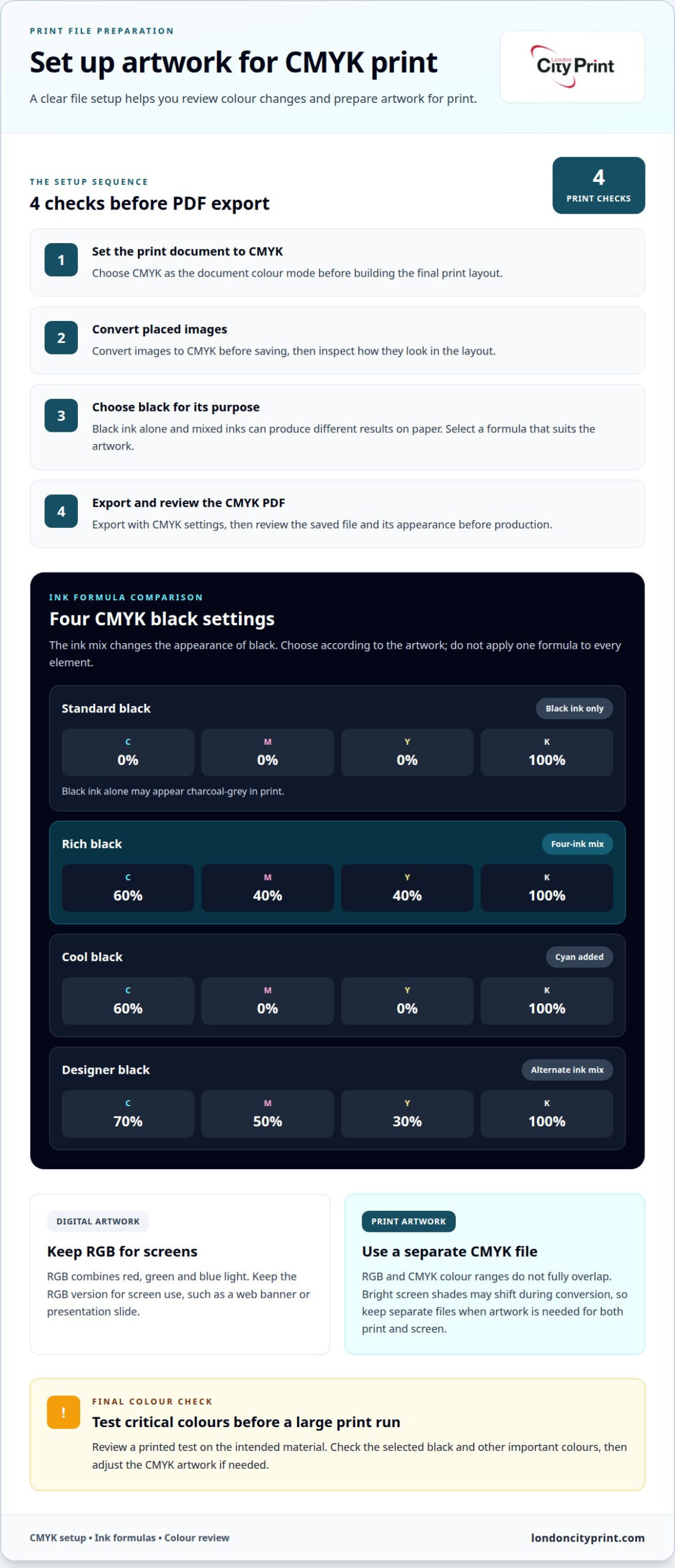
Use this short setup sequence for a print PDF:
- Choose CMYK as the document colour mode for the print version.
- Convert placed images to CMYK before saving, then inspect their appearance in the layout.
- Set black elements according to their purpose, using black ink alone or a richer mixture.
- Export the artwork as a PDF with CMYK settings, then review the exported file.
Black needs particular care because “black” can mean different ink combinations in a CMYK file. Standard print black usually uses 100% K, meaning black ink only. That setting can appear charcoal-grey in print. For a deeper black, a common rich black formula combines C: 60%, M: 40%, Y: 40%, K: 100%. The right choice depends on the artwork and material, so avoid applying one formula blindly to every element.
- Standard black: C: 0%, M: 0%, Y: 0%, K: 100% uses black ink only.
- Rich black: C: 60%, M: 40%, Y: 40%, K: 100% combines all four inks.
- Cool black: C: 60%, M: 0%, Y: 0%, K: 100% adds cyan to black ink.
- Designer black: C: 70%, M: 50%, Y: 30%, K: 100% uses a different ink mix.
Keep RGB for digital designs that will remain on screens, such as a web banner or presentation slide. RGB builds colour from red, green and blue light, making it suited to screen-based artwork. If a campaign needs both a printed brochure and digital graphics, maintain separate CMYK and RGB files. This preserves a screen version while allowing the print file to use CMYK settings.
Before approving a large run, test colours in print. Printers should test colours before printing a large run, such as 500 copies. A test can reveal how the chosen black and other colours appear on the intended material. Review the printed result, then adjust the CMYK artwork if needed. This final check helps identify colour differences before the full quantity goes to production.
Color shifts when converting RGB to CMYK
RGB artwork can change appearance after conversion because print inks reproduce a different range of colours. The shift depends on the original colour, the selected CMYK profile and the print conditions.
Subtractive Color in CMYK Printing
CMYK is a subtractive colour model: inks absorb parts of the light reflected from white paper. Cyan, magenta and yellow inks combine to create colour, while black ink adds darker tones and detail. In practice, cyan, magenta and yellow alone produce a muddy brown rather than clean black. That is why CMYK printing uses a fourth ink, black. The printed result depends on ink mixtures and paper, not screen light.
Previewing CMYK Colors
A CMYK preview simulates how colours in a digital document may appear after conversion and printing. To preview CMYK colours, enable your design software’s soft-proof view and select the intended output profile. Inspect saturated areas, gradients and brand colours for visible changes. Soft proofing helps identify likely shifts on screen, but cannot show every physical effect of paper and ink. Review critical colours carefully before approving the final file.
Choosing a CMYK Print Profile
A CMYK print profile describes how a particular output process reproduces colour. For a print job in the United States, no single profile suits every printer, paper and production setup. Choose the profile that matches the print conditions, including paper type and press process. A profile for one stock may predict different results on another. Use the profile specified for the job, rather than choosing one simply because it appears in your software.
Conversion maps RGB values to colours available in the selected CMYK space. If a bright screen colour falls outside that space, the software substitutes a printable colour. For example, vivid electric blue may look less saturated after conversion. The shift can also affect contrast between nearby shades, changing how a gradient or small colour detail appears.
Set the colour mode deliberately in your design software. In Adobe Photoshop, check the document mode menu; in Adobe Illustrator, inspect the document’s colour mode settings. If the file remains RGB, convert a duplicate to CMYK for print and keep the original for screen use. This prevents the print conversion from replacing the version prepared for digital display.
To check a document’s colour mode, open its colour settings or document information panel and confirm whether it identifies RGB or CMYK. Check placed images separately, since an RGB image can sit inside a CMYK layout. Before export, review the document and linked images, then inspect the saved PDF’s output settings. These checks help catch unexpected RGB elements before production.
Conversion is most useful for seeing likely print changes early, not for achieving a perfect screen match. For a logo or campaign colour, compare the original RGB artwork with its CMYK version. If the difference matters, adjust the CMYK values within the selected profile and review the appearance again. This keeps colour decisions intentional.
RGB vs CMYK: What’s the difference?
RGB and CMYK describe colour in different ways, so screen artwork and printed artwork will not always match. Their colour ranges overlap, but neither can reproduce every colour in the other.
Screen and Print Color Gamut
A color gamut is the range of colors a system can display or reproduce. RGB screens can create 16.7 million possible colors through different red, green, and blue values. CMYK printing combines cyan, magenta, yellow, and black inks, but its printable range differs from a screen’s range. This matters when your artwork uses intense digital colors, because some shades fall outside what print can reproduce.
Consider a highly saturated blue in a website graphic. Your display emits that colour as light, while a printed page relies on light reflected from ink and paper. If the blue sits outside the CMYK gamut, the printed version must use a closer reproducible shade. It may look less vivid, even when the layout and colour values remain unchanged.
RGB and CMYK colour spaces do not completely overlap. A colour on an RGB monitor may not have an exact CMYK equivalent, and a print colour may not look identical on every display. For a logo used on both a website and a printed brochure, plan separate screen and print versions when colour consistency matters.
The practical difference is the output you are preparing. Use RGB for graphics that will remain on screens, such as a presentation slide, and CMYK for artwork intended for print. A design moving between these uses needs deliberate conversion, rather than the assumption that one set of values will look identical everywhere.
Converting Between Color Modes
Converting between RGB and CMYK maps colours from one colour space into the range of another. This matters because conversion can alter colours the destination space cannot reproduce. Before saving a print file, convert images to CMYK and review the result. Keep a separate RGB original for digital use, so conversion does not replace the version designed for screens.
For a practical example, start with an RGB product image containing bright green packaging. Convert a duplicate to CMYK, then compare the green and surrounding tones. If the converted green looks less intense, adjust the printable colour while preserving the original image for online use. This keeps the intended screen artwork intact while preparing a print-specific version.
Use this comparison to decide which version your project needs:
- RGB file: Keep it for a website, digital advertisement, or screen presentation.
- CMYK file: Prepare it for a printed brochure, poster, or other ink-on-paper output.
- Separate versions: Maintain both when the same design serves screens and print.
For consistent results, convert before final PDF export instead of relying on a last-minute automatic change. Check photographs, placed graphics and large colour backgrounds, as each can contain shades that shift during conversion. Comparing the RGB original with the CMYK proof helps you identify which changes affect the message or visual hierarchy.
Colour conversion cannot create an exact match for every out-of-gamut shade. It translates the colour into a printable alternative, so the key question is whether that alternative still works for the design. A bright accent may tolerate a shift, while a brand colour may need closer review across screen and print versions.
RGB additive color and screen displays
An RGB value describes the strength of red, green and blue light at a pixel. Reading the three channel values separately helps explain how a displayed colour is formed.
RGB Color on Screens
Digital screens form images from thousands, and sometimes millions, of pixels. Each pixel contains red, green, and blue lights whose intensities range from 0 to 255. The three channel values work together: RGB (0, 128, 255), for example, specifies no red light, moderate green light, and full blue light. This structure lets software describe a pixel’s color precisely.
A graphic’s overall appearance comes from how pixel values vary across its area. A smooth blue field can use similar RGB triplets across neighbouring pixels, while a sharp edge changes values quickly. For instance, a light blue region can meet a dark blue one through changing channel intensities. Understanding the triplets helps identify which channel contributes to a colour difference.
Additive Color Mixing
Additive mixing combines light from the three RGB channels. More light moves the combined result closer to white, while no light produces black. When adjusting a colour, changing one channel affects the mixture without requiring changes to the other two.
For example, compare RGB (0, 128, 255) with RGB (0, 128, 200). Red and green remain unchanged, but reducing blue changes the combined color. This is a useful way to reason through a color adjustment: identify the channel that needs a change, then alter that value while holding the others steady. Setting all three channels to 255 produces pure white.
Channel values can help maintain consistent colour choices within a digital file. Record a chosen triplet, then apply the same values wherever the design needs that colour. A logo accent and matching heading can share identical RGB values, reducing avoidable variation within the document. This works at the value level, regardless of how the layout arranges its shapes and text.
Black provides a clear reference point for understanding additive light. RGB (0, 0, 0) means each channel contributes no light, so the combined result is black. Raising one or more channel values adds light and changes the result. By contrast, maximum intensity across red, green, and blue produces white. These endpoints make the model easier to interpret when checking color values.
Think of RGB as three adjustable light controls, not a fixed palette of named colours. A specific triplet defines a combination, and changing one number changes that combination. To inspect digital artwork, read the red, green and blue values, identify the channel driving the appearance, then make a targeted adjustment rather than changing every channel at once.
When to use CMYK for print
Use CMYK when artwork enters a physical print workflow and the production file needs to reflect its intended output. Decide after clarifying what the piece must communicate, where people will read it and which colours carry essential meaning.
Start with the role of colour in the finished item. A colour-coded training manual, for example, may use distinct shades to separate instructions from warnings. A printed annual report may rely on consistent brand colours across charts, headings and section markers. Decide which colour relationships must remain clear, rather than judging each shade in isolation.
CMYK preparation also matters when several pages belong to one coordinated project. A cover, contents page and section divider can use colour differently while still feeling like parts of one document. Review recurring elements together, including logos, headings, chart labels and background panels. This helps you spot design inconsistencies before production begins.
- Colour carries meaning: Identify shades that distinguish categories, instructions, or warnings.
- Several pieces work together: Review shared design elements across the complete set.
- Print is the final output: Prepare the production artwork around the physical item’s purpose.
- Colour is decorative: Decide which visual details can change without affecting understanding.
For a document with charts, ensure each category remains distinguishable through labels and layout, not colour alone. This gives the design another way to communicate if shades appear closer together in the finished piece. In a training guide, pair colour blocks with clear headings so readers can identify sections quickly.
For a coordinated set of materials, establish shared colour decisions before finalising individual pages. Apply the same approach to repeated logos, headings and navigation elements, then review the complete artwork in sequence. This makes it easier to judge whether the design feels consistent from one page or item to the next.
Choose CMYK preparation when the physical print is the intended final format, and make colour decisions in the context of the complete design. For artwork going into production, prepare your print artwork with the finished item and its purpose in mind.
London City Print
London City Print can turn your CMYK-ready artwork into printed materials, including booklets and brochures, posters and roller banners. If your project needs pages that open flat, wire binding is also available. Use the colour guidance above when preparing artwork, then choose the format that suits how people will read or display it.
For example, a brochure can carry detailed product information, while a poster or roller banner presents key visuals at a glance. Keep the intended print output in mind when choosing colours, and review important brand shades in the CMYK artwork before production.
If you’re preparing a print project and want to discuss the right format, contact London City Print.
Set Your Print Project Up for the Next Step
Before sending artwork to production, identify the colours that matter most to your project. Note any brand shades or visual distinctions readers must recognise, and keep those priorities with the final file. This gives your print decisions a clear purpose and focuses review on what matters to the finished design.
The RGB vs CMYK for printing decision is one part of preparing artwork for a real-world result. A clear brief can also state the intended use, the details that need close colour attention and how the finished piece should communicate. Those priorities help keep the production conversation focused.
If you’re ready to discuss your print project, contact London City Print. A clear starting point can help you move forward with confidence.
Frequently Asked Questions
What is RGB?
RGB is a colour model built from red, green and blue light. A digital design assigns an intensity to each channel to create colours for screens. For example, a designer can adjust the red channel in a product image while leaving green and blue unchanged. This model suits screen-based work such as web graphics and presentations, where the display creates the image from light.
When should I use RGB?
Use RGB when your finished artwork will appear on a digital display. Examples include website graphics, presentation slides and images for online campaigns. Keep a screen version in RGB if you also plan to print the design. You can then prepare a separate print file without replacing the original colours used in your digital layout.
What is the difference between RGB and CMYK color models?
RGB represents colour through red, green and blue light, while CMYK represents it through cyan, magenta, yellow and black inks. This distinction affects how a design appears on different outputs. A bright screen graphic and its printed version may not match exactly. For a campaign across screens and printed materials, plan separate versions suited to each output.
Why do RGB colors look different when printed in CMYK?
Some RGB colours fall outside the range CMYK inks can reproduce, so conversion maps them to printable alternatives. A bright accent in an online advertisement may therefore look less intense on a printed handout. The change can also affect contrast between adjacent colours. Review important brand colours in the print artwork, especially if they carry meaning or guide the reader’s attention.
Should artwork be created in RGB or CMYK for printing?
Prepare the print version in CMYK, the recommended colour mode for designs intended for print. If the project also needs screen graphics, retain an RGB version for those uses. For example, a product launch may need a printed brochure and a digital presentation. Separate files let you prepare each output appropriately instead of relying on one colour setup for both.
How do I convert an RGB image to CMYK without losing color quality?
You cannot preserve every out-of-range RGB colour exactly in CMYK, but you can protect the original image. Save a copy, convert it using the print profile for the job, and inspect areas with strong colour or gradients. Use your software’s soft-proof view to assess likely changes. Keep the RGB original for digital use and revise the print copy only when needed.
Which RGB colors are outside the CMYK print gamut?
There is no fixed list of RGB values that always fall outside CMYK, because available print colours depend on the selected profile and printing conditions. In general, highly saturated digital colours are more likely to shift during conversion. Check the artwork with the gamut preview in your design software. It can flag colours the selected CMYK profile cannot reproduce as entered.
Should I send RGB or CMYK files to an online or local print shop?
Send a CMYK PDF for print unless the printer’s file instructions specify another workflow. A print-ready CMYK file makes the intended colour mode clear, while an RGB file may need conversion. Before exporting, inspect images and graphic elements for unexpected colour modes. If the job includes both print and screen artwork, keep the RGB version separate from the print file.