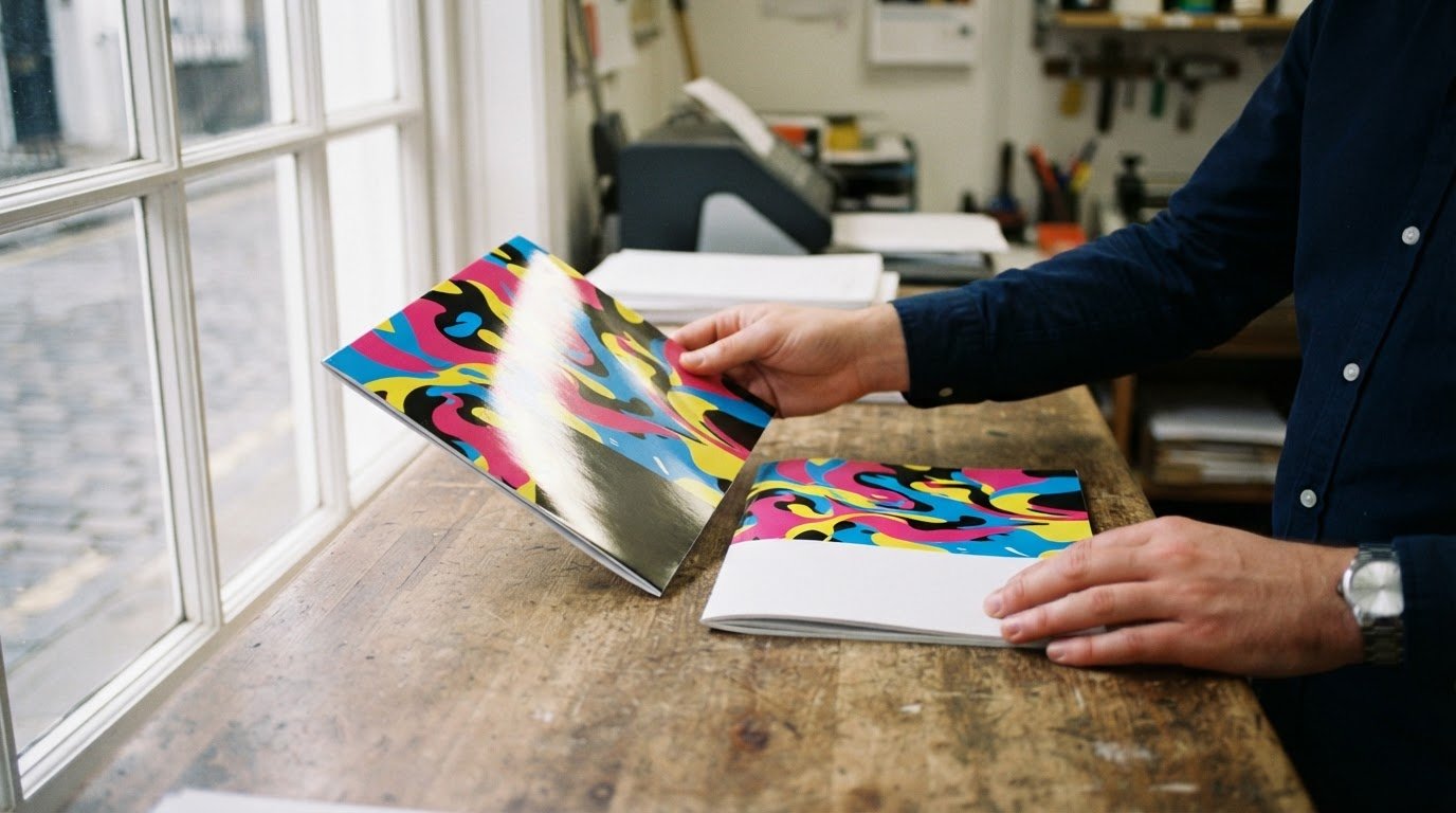
The gloss vs matt lamination choice shapes how your printed design looks and feels in use. Gloss creates a shiny surface that can intensify colour, while matt gives the print a quieter, less reflective appearance. Neither finish suits every design, so consider the message you want the print to convey and where people will see it.
You may already have a preferred look, but the right choice also depends on practical needs. A piece displayed under bright lights has different priorities from one that people handle often. The finish can affect how clearly viewers read the design, how visible marks are, and which details attract attention.
This guide compares the finishes by appearance, feel, glare, fingerprints and durability. It also explains how spot gloss can emphasise selected areas over a matt surface. Use these factors to set a clear direction for your print project, whether you’re preparing a brochure, business card or another printed item. Weigh the visual effect against the intended use and choose a finish that supports the design rather than distracting from it.
Key Takeaways
- Choose gloss when you want printed colours and images to appear brighter and more striking.
- Consider matt for a restrained look that reduces reflections and can make text easier to read under direct lighting.
- Think about handling as well as appearance: gloss is easier to clean, while matt can conceal fingerprints and smudges.
- Use spot gloss over a matt finish to draw attention to selected design details with contrast.
- Match the finish to where people will view and handle your print, and the impression you want it to create.
What is Gloss Lamination?
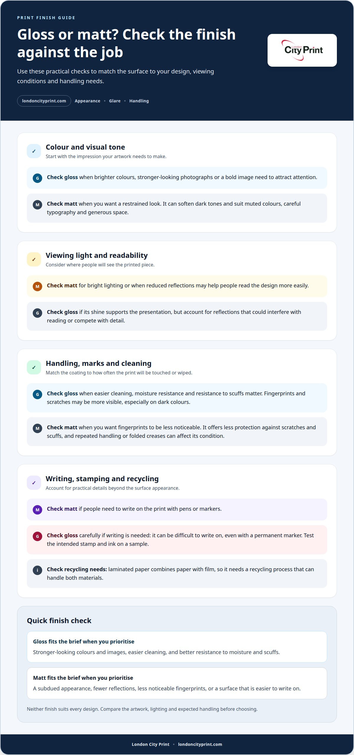
Gloss lamination covers a printed sheet with a shiny film that reflects light. This reflective surface can make ink colours and photographs appear more vivid, helping a product image or bold title stand out. The choice between matt and gloss affects both appearance and handling, so consider the finished piece’s purpose before selecting a coating.
Gloss offers practical protection as well as visual impact. Compared with matt, it generally resists moisture, scuffs and scratches better, and its smooth surface is easier to clean. That can help with a menu or another printed piece that needs regular wiping. However, reflected light can interfere with reading, and fingerprints or scratches may be more visible on glossy areas, especially against dark colours.
Matt lamination adds a protective coating, though repeated handling can affect its condition. A folded brochure, for example, may show wear along its creases. Matt can make fingerprints less noticeable and reduce reflections, but it isn’t the stronger choice for every handling condition. Compare the expected use with the finish’s appearance rather than assuming either surface prevents all damage.
Gloss pros and cons: Gloss can strengthen colour, resist moisture and scuffs, and make cleaning easier. Its reflective surface can create glare, while fingerprints and scratches may be easier to see.
Matt pros and cons: Matt reduces reflections and can conceal fingerprints, creating a restrained look. It offers less protection against scratches and scuffs than gloss, particularly with repeated handling or folding.
Writing and stamping need separate consideration. Matt is easier to write on with pens or markers, while gloss is difficult to write on, even with a permanent marker. Plan any handwritten information before choosing a finish, and test the intended stamp and ink on a sample. For recycling, laminated paper combines paper with film, so it needs a recycling process that can handle both materials.
| Finish | Appearance | Handling | Useful consideration |
|---|---|---|---|
| Gloss | Shiny; colours and images can appear stronger | Easier to clean; better moisture and scuff resistance | Reflections and visible marks may affect presentation |
| Matte | Soft, subdued, less reflective | Can conceal fingerprints; more prone to scratches and scuffs | Writing is easier than on gloss |
Choose gloss when colour impact, easier cleaning or moisture resistance matters most. Choose matt when reduced reflection and a subdued surface better suit the design.
Matte lamination’s premium and understated appearance
A matt finish gives a printed design a restrained visual character. It softens the contrast of darker colours, so a deep green background may feel less dramatic than the same artwork with gloss. This effect can support a premium impression when the layout relies on careful typography, generous space and a limited palette. Matt does not change the design itself; it changes how its printed colours appear on the surface.
Gloss creates a brighter, more reflective appearance. It can make a photograph or saturated graphic attract attention, which suits artwork built around strong imagery. The same reflection can compete with detail, especially when the print is viewed under bright lighting. A matt surface keeps the presentation quieter, helping the composition feel composed rather than attention-seeking.
Consider how the finish supports the design hierarchy. If a brochure cover leads with a dark title and small supporting text, matt can give the page a calm, editorial quality. If the cover depends on a colourful product photograph, gloss can bring more visual energy to the image. The most effective finish reinforces the main element instead of pulling attention away from it.
Colour choice matters too. Matt can soften dark tones and reduce the sharp contrast between a dark background and lighter lettering. This can suit natural palettes, muted brand colours or artwork intended to feel subtle. Gloss can intensify the perceived colour and image, so it may suit a lively campaign or a cover that needs to catch the eye in a display setting.
Think about the viewing angle as well as the artwork. A glossy sheet can catch changing reflections as someone moves it, making the surface appear dynamic. Matt presents a steadier, less reflective look from different angles. For a premium product presentation, that restraint can feel deliberate; for an image-led promotion, the stronger shine may better match the desired impression.
Neither finish automatically makes a print look more sophisticated. The result depends on whether the surface aligns with the design’s purpose. Review the darkest colour, the most important image and the smallest text, then decide which should lead. Choose matt for an understated, controlled appearance; choose gloss when brighter imagery and visual impact take priority.
If your artwork needs a considered finish, plan the print design around its colour palette, image treatment and intended impression. That decision gives the surface a clear role in the overall presentation, rather than making it an afterthought.
Matte lamination’s soft-touch, non-reflective finish
Matt lamination gives a printed surface a smooth, low-reflection appearance. Soft-touch lamination, also called velvet lamination, adds a velvet-like feel that changes how someone experiences a cover or package in hand. The matt finish reduces reflected light, helping to limit glare. It can also hide minor imperfections in packaging material, helping the surface look composed during handling.
Let the lighting guide your finish choice. A brochure placed beneath bright overhead lights is easier to read with matt lamination because the surface reduces reflections. Gloss reflects light, which can make text harder to read in some conditions. For a photo displayed under changing light, gloss can make colours and images stand out, but a strong reflection may compete with the image itself.
Touch matters too. Matt lamination adds a tactile quality that can make packaging more interesting to hold. Choose it when a smooth, restrained feel supports the impression you want, such as packaging for a luxury product or one with a natural or organic identity. Soft-touch is a specific type of matt finish, so consider whether that velvet-like feel suits the design rather than assuming every matt laminate feels the same.
Match the finish to the printed item and its use. A photo-led brochure may benefit from gloss when bright colours and image impact take priority. A text-heavy brochure can use matt to limit reflections around paragraphs and headings. For a high-end business card, matt offers an understated surface; gloss may suit a card whose design depends on bold colour. Packaging for art-related products can also suit matt’s quieter presentation.
Durability depends on how the print will be handled. Matt lamination can resist minor moisture and short-term splashes, but it isn’t completely waterproof. It can also scratch or scuff through repeated use, particularly around folds. For packaging that people handle often, weigh matt’s tactile appeal against its susceptibility to wear. Gloss generally offers better water resistance and durability, though its reflective surface can affect readability.
Which finish works best for photos, brochures and business cards? Gloss suits photos when you want brighter colours and strong image impact; matt suits brochures when reduced glare and comfortable reading matter more. For business cards, choose matt for an understated, tactile impression, or gloss to emphasise colour.
Decide by considering three factors: the lighting where people will view the print, how often they’ll handle it, and the impression the finish should create. This helps align appearance, readability and durability with the purpose of each printed piece.
Glare, fingerprints, and smudges
Lighting and handling both affect how clean a laminated print looks. Compare the surface, the artwork’s colours and how often people will touch it before choosing a finish.
Glare and Smudge Visibility
A reflective gloss finish catches light, so overhead lighting can create glare across a brochure cover or menu. Gloss also shows fingerprints and smudges more readily than matt, especially on dark areas. Its advantage is easier cleaning: wiping the surface can remove marks, making gloss practical for prints that need frequent cleaning. Lighter colours can make fingerprints less noticeable on gloss.
Matte Texture and Fingerprints
Matt lamination gives a smooth, understated appearance and can hide fingerprints and smudges. It generally makes fingerprints, scuffs, scratches and dirt less noticeable than glossy film packaging, so a matt package can look cleaner after handling. This is a visual difference, not a guarantee that marks won’t appear. Repeated contact can still affect the finish, particularly where a print bends or folds.
Consider a dark business card handled at a networking event. Gloss can make the colour appear striking, but fingerprints may stand out on its reflective surface. Matt can make those marks less visible and keep the design restrained. On a light-coloured card, gloss fingerprints may be less apparent, while its shine still changes how the card looks under bright room lighting.
A menu passed between customers calls for a different balance. Gloss is easier to clean, which helps when staff regularly wipe the surface. Matt can reduce glare above a table, but it may show wear from repeated handling or scuffing. Choose based on the task: frequent cleaning favours gloss, while reduced reflections and less visible fingerprints favour matt.
Texture affects the impression as well as the visibility of marks. A smooth matt surface keeps the presentation quiet, while gloss adds a polished shine that draws attention to the printed colours. For packaging with a dark, uninterrupted panel, matt can help conceal fingerprints. For a colourful label that needs easy cleaning, gloss may suit better, though reflections can affect readability under direct lighting.
- For bright lighting: choose matte to reduce reflections over text.
- For frequent wiping: choose gloss because it’s easier to clean.
- For fingerprint visibility: consider matte, or lighter colours with gloss.
- For frequently handled packaging: weigh matte’s mark-hiding appearance against possible scuffs.
These trade-offs make the finish decision practical: identify the main source of visible wear, then choose the surface that best manages it. A print displayed under strong lights has different needs from packaging that gets wiped throughout the day.
Combining matte lamination with spot gloss
Matt lamination and spot gloss combine two surface effects on one printed piece. The matt area provides a soft, low-reflection background, while spot gloss adds shine to selected design details. This contrast creates a focal point without giving the entire surface a reflective finish. The effect works best when the highlighted elements support the message rather than compete with it.
Start by deciding what viewers should notice first. On a brochure cover, spot gloss could highlight a logo, title or key image against the matt background. On a business card, a glossy mark can draw attention to a name or brand symbol. These are design choices, not fixed rules. Select a focal element that already matters to the layout.
The visual difference comes from contrast in both light and texture. Matt areas diffuse light, while spot gloss reflects it from selected parts of the design. As someone tilts the printed piece, those glossy details catch the light and become more noticeable. The result can be more interesting to touch and view than using a single finish across the whole surface.
Keep the artwork clear. A single prominent logo can read more strongly than several scattered glossy accents. If a cover includes a large photograph, consider highlighting one distinct feature instead of applying spot gloss to every image detail. Small, intricate shapes may lose impact when viewed from a distance, so judge the effect at its intended viewing size.
Plan the hierarchy before preparing the final artwork. Identify the main message, choose the detail that supports it, then make the contrast between that detail and its matt surroundings intentional. For example, a product name can take priority over decorative lines. A logo can remain the focal point while supporting copy stays on the matt surface, without extra shine.
Spot gloss is not a substitute for a clear design. If every element competes for attention, adding selective shine can make the layout feel busier rather than more polished. Use it with restraint, especially on information-heavy pieces. The matt base keeps the overall appearance controlled; the glossy accent gives one chosen area extra emphasis.
For a practical decision, review the design at its final size and identify one or two details that deserve emphasis. Ask whether the glossy area strengthens the message and whether the remaining matt surface preserves readability. This pairing gives you more control than choosing an all-over gloss or matt finish alone.
If you’re preparing a brochure or business card with a clear focal detail, discuss your print design and the finish you want to achieve.
London City Print
London City Print can help turn your finish decision into a print-ready project, from Booklets and Brochures to posters and roller banners. If your layout needs pages held together, wire binding offers a practical finishing option for suitable printed documents.
Bring your artwork and intended use into the decision: a text-led brochure, a colour-focused poster and a bound document each serve a different purpose. The surface and format should support how people view, handle and read the finished piece. London City Print can produce printed materials to support your project once you’ve settled on the visual direction.
Contact London City Print to discuss your print project.
Make Your Finish Work for the Final Design
Use your decision about gloss vs matt lamination as part of the wider design brief. Consider the message, viewing conditions and handling your printed piece will face, then carry that direction consistently through the layout and format. A clear brief helps align the finished print with the impression you want to create.
For a project that includes a brochure, poster or bound document, plan the format and presentation together. London City Print offers Booklets and Brochures, Posters and Wire Binding to support different print requirements. Share your project’s purpose and chosen design direction to keep the next production steps focused on the result you need.
Contact London City Print today to discuss your print project and its requirements. With a considered finish and a clear production brief, you can move forward with confidence.
Frequently Asked Questions
What is Matte Lamination?
Matt lamination is a protective film with a subdued, low-reflection surface. It can suit a printed piece where a calm appearance matters more than shine, such as a text-focused presentation cover. The finish affects how the design appears, so consider the artwork’s darker areas and fine details before choosing it. If the print will be folded or handled often, account for matt film’s susceptibility to scuffs.
How to Choose the Right Lamination?
Start with the print’s purpose, then consider its viewing conditions and handling. For a photo-led piece intended to attract attention, gloss can strengthen colour impact. For information read beneath overhead lights, matt can reduce reflections. Next, consider whether fingerprints, cleaning or folding will be frequent. If neither all-over finish suits the design, spot gloss over matt can draw attention to a chosen detail.
What is the difference between gloss and matte lamination?
Gloss lamination creates a shiny, reflective surface, while matt lamination has a softer, less reflective appearance. That difference changes how viewers experience the same artwork: gloss can make colours and images appear stronger, while matt creates a quieter presentation. Matt also softens dark colours, so a black or deep blue area may have less contrast than it does under gloss.
Does gloss or matte lamination show fingerprints, scratches, or glare more?
Gloss can show fingerprints and smudges more readily, and its reflections may create glare under direct lighting. Matt can conceal fingerprints and reduce reflections, but repeated handling may leave visible scuffs or scratches. For a frequently wiped menu, gloss’s easier-to-clean surface may matter most. For a dark cover handled by hand, matt may keep fingerprints less noticeable.
How do gloss and matte lamination affect color, contrast, and readability?
Gloss can make printed colours and images look brighter, which may benefit a photo-heavy cover. Matt softens darker colours and reduces reflected light, helping readers focus on text in bright surroundings. Check the design’s main purpose: a large image may need visual impact, while small copy needs comfortable reading. The finish changes the surface appearance, not the information or colour values in the artwork.
How do you choose between gloss and matte lamination for a print project?
Choose by matching the finish to the job rather than treating one as universally better. For a brochure viewed under bright lights, prioritise reading comfort; for a promotional image, prioritise colour impact. Then consider how people will handle and clean the piece. A foldable, frequently handled print needs particular care, since matt can scuff around folds and gloss may show marks.
Are there alternatives such as soft-touch or satin lamination?
Soft-touch lamination is an alternative with a smooth, velvet-like feel, also called velvet lamination. It adds a tactile quality while retaining a matt-style appearance. Satin is another printing term for a surface between high shine and a fully matt look. Compare how each finish renders your artwork and feels in hand before selecting one for your finished print.